Godot

I forget exactly where I originally read about the Godot Engine but I decided to give it a try after I completed my map generator. The verdict: Godot is extremely good. I should note that I have not tried using it for 3D projects, just 2D game projects. Here are some things that stood out to me.

Supported Languages

Godot supports several languages, including C++, C#, D (GDNative), JavaScript and Nim. It even has its own proprietary integrated language, GDScript. A Godot user created a benchmarking tool that helps give an idea of how well each language performs. C# support is still in its early stages, unfortunately, and you can’t use Visual Studio for debugging… Yet! Given some time these functionalities will be added. For now you have to use VS Code to debug, which admittedly isn’t that major of an issue.

Supported Platforms

Windows (and Xbox One by extension), Linux, OSX, iOS, BlackBerry 10 and HTML5 are supported. Other console support cannot be included with Godot as console SDKs are proprietary and all of Godot’s code is open source. There are ways to deal with this limitation, as outlined in the Godot docs.

Organization

Godot and Unity use a lot of similar approaches when it comes to organizing a game project.

Unity uses the entity/component paradigm with scenes and prefabs. Godot instead uses a tree approach to accomplish the same thing. Everything is a tree of nodes. Your scene is a tree containing several nodes for the interface, game elements, and so on. Prefabs are just a tree of nodes. Everything is organized in this manner.

What makes Godot stand out is that there is no distinction between scenes and prefabs like there is with Unity. Scenes and prefabs are the same thing, functionally. If you wanted to, you could instantiate several scenes inside of your main scene. There’s no limitations as to what you are allowed to do.

A GameObject in Unity can have several components, so you have to take a slightly different approach when you want to accomplish the same thing in Godot.

If this were Unity, some of these things would just be components of the base PlayerTest node. Personally i think i prefer Godot’s approach. This way, you can see every component at a glance without having to inspect entities to see which components they contain.

Each node performs a specific task. An AnimatedSprite node renders a sprite and handles its animations, a RigidBody node controls a rigid body, and so-on. When you’re used to being able to have several components on a single GameObject in Unity, it can be a little jarring at first. The upside of Godot’s node system is that it’s very easy to keep track of everything since every component is its own node with whatever name you decide to give it. Instead of having a bunch of components tied to a GameObject, you have a tree of the various nodes your game element requires.

Animation

Godot has an incredible integrated animation system that works for both 2D and 3D projects. The general workflow is:

  1. Set up your skeletal heirarchy.
  2. Create animations.
  3. Use blend trees and state machines to control the current animation state in-game.

Not only is the animation system intuitive and easy to use, it also allows you to wire function calls to specific keyframes in the animation. It’s been perfectly planned from start to finish.

Workflow

Debugging a project can initially be more tricky with Godot compared to other engines like Unity. With Unity you can set up a scene then run it in debug mode and pause the game so you can browse the active scene in the editor window. This allows you to tweak variables and move things around in the live scene so you can really get an idea for what is causing bugs and how certain elements are interacting.

With Godot you can pause execution and examine the instanced entities in the scene tree but the interactivity isn’t there. You can’t see the active game instances rendered in the editor pane so you can’t dive in and disassemble things like you can with Unity. This is probably my biggest gripe with Godot’s debugging workflow.

Other Considerations

As mentioned before, Godot represents a game scene with a tree of nodes. In Unity you can access a GameObject’s component pretty easily. How do you do this in Godot when your components are organized in a tree structure?

var list = GetNode<VBoxContainer>("CenterContainer/Units/UnitContainer");

Nodes in Godot are organized visually as a tree, but when accessing them via code you use a string path.

I ended up writing some utility functions for creating nodes via code since it tends to get a little obnoxious without them.

public static T Instantiate<T>(string path) where T : Node
{
    string temp = "res://Prefabs/#.tscn";
    string filepath = temp.Replace("#", path);
    var node = GD.Load<PackedScene>(filepath);
    T inst = (T)node.Instance();

    return inst;
}

...

// Usage example
var player = Util.Instantiate<PlayerController>("Characters/PlayerTest");

Conclusion

Godot is shaping up to be the first open source game engine that is on par with existing game engines. Even in its current state i’d consider it a viable alternative to other existing 2D game engines. As it matures i expect it will get more and more attention.

Noita Enhanced

Noita is a brilliant action roguelite (I hate this term) where every pixel is simulated. Compared to your standard roguelite, there’s a greater focus on using the environment to your advantage. What really excited me the most about it was the degree to which the game can be modded.

Under the hood

Noita uses Lua for handling all scripting-related tasks. Serialized entity data is stored as XML files and there is a heavy reliance on an entity/component relationships for organization.

Virtually all aspects of the game logic are modifiable via the existing Lua scripts. A modder can override certain scripts or XML files or append new data with relative ease.

What needs changing?

When I start modding a game, it’s usually for one of two reasons: I have ideas for new features that I think should be in the game, or I find certain aspects of the game to be lacking or incorrectly implemented. With Noita, it was a mixture of both.

I skipped over some of the stuff i made since i don’t have a gif for everything, the entire list of mods i’ve made can be found here.

High risk, high reward

In Noita, the player progresses by collecting magic spells to append to their magic wand. There are certain spells which are considered to be must-haves, and once you find them you have a better chance of reaching the end of the game… If you can mitigate their inherent risk. One glaring problem I saw with the game progression is that the variety of these must-have spells is too limited. Creating new spells that fit this category was not too hard, the biggest thing to consider was the risk/reward factor involved. In order to balance out the stronger spells, they have to be made difficult to use.

Both of these spells are incredibly powerful, but they also have some inherent risk in their use. The freezing spell creates a small shower of damaging ice particles that can harm the player, and if the player manages to get caught in the blast they will be frozen for a short period of time. The magma explosion is very short range and also creates a small shower of magma which can harm the player and ignite them. Shooting it straight upward isn’t possible unless you’re willing to take some damage from the magma that falls on your face.

Miscellaneous spells

I made a handful of other fun little magic spells that I thought fit the game well, such as a projectile modifier that makes your projectile suck in nearby objects.

Perks

Perks are a major component of Noita. The player descends through several biomes and at the end of each biome they reach a “safe room” where they can regroup, heal, and adjust their magic spells. At the end of each safe room the player is given 3 random perks to choose from. A perk changes an aspect of the player to make them more powerful in some way. There are perks that make the player more resilient to damage, perks that increase the player’s mobility, and so-on. I thought the selection of default perks was a bit lacking so I created a handful of my own.

This perk makes the player summon sprites that attack their enemies automatically. These sprites are technically an NPC, but i used the entity/component system to give them a projectile component. In a technical sense, they are a living projectile.

Both of these perks give the player an inherent trail of either fire or ice. The trail applies a burning or freezing effect to enemies that enter it, and it also interacts with the environment as you’d expect. The fire trail causes oil to ignite and turns water to steam, and the ice trail freezes any liquid it touches.

Altars

Giving the player random places that allow them to trade objects for rewards was something i wanted to do, so I implemented new altars which have a small chance to appear in any given run.

This altar makes use of the game’s pixel engine to convert corpses into gold dust pixel by pixel. It looks neat and gives the player a way to generate income using nearby corpses.

Magical stones

The world is littered with enemies and treasure, but it also contains objects the player can pick up and store in their inventory, such as flasks of water. There is one unique object, a stone that emits electrical charges, which caught my interest. I decided to make different versions of it.

The holy stone converts impure substances such as blood to water. The fire stone melts through ice and converts water to steam.

Quality of life

There were several small aspects of Noita that annoyed me, so I modded them. I don’t have much footage of these mods in action because they aren’t especially exciting.

Putting it all together

I kept all these mods separate from eachother so that i could allow the end user to pick and choose which features they want and customize their experience to their liking. I created a modworkshop entry containing the github link to my mod collection. It quickly became one of the most popular Noita mods. This, to me, is affirmation that my assumptions about what aspects of the game needed changing were correct!

Mordhau CTF

I previously discussed the process of making a custom map for Mordhau. Finishing my first map left me with a feeling of dissatisfaction, like there was still work to do. With a more complete understanding of what the uSDK is capable of, I set out with a more ambitious goal of creating a whole new game type. The obvious choice for this was capture the flag, something that i thought would translate well to a game where melee combat and teamwork are at the forefront.

Luckily, someone had already created a very barebones capture the flag mod and publicly released it. Much of the difficult work had been done, so I could really focus on the finer details and figure out what needed changing.

Fine tuning

It took several iterations, but i finally managed to massage the CTF mod into something i thought was more appropriate for Mordhau.

Stalemates

The basic CTF mod neglected to implement any sort of stalemate mechanic, which i think is a crucial aspect of capture the flag. The idea is that if the enemy team is in possession of your flag, you cannot capture theirs until the stalemate is broken. This creates a situation where both teams have to simultaneously defend their flag holder while attempting to break through the other team’s defences and kill the enemy flag holder.

A badass flag

I grew up playing CTF in games like Halo and Soldat, and one of the important concepts in both of those games is that the flag runner still has the ability to defend themselves, though it may be in a somewhat limited capacity. In Halo, you could bash people to death with the flag. It’s worth mentioning that the flag also looked really cool. Improving on the appearance of the flag was one of the things I did almost immediately.

Now we’re cooking. Achieving this was easier than i thought. The flag object is derived from the quarterstaff weapon blueprint. The skull, coiled rope segments and flag are all meshes (with all collisions disabled) parented to the quarterstaff with a vector offset to move them closer to the end. Simple but effective.

Since the flag object derives from the quarterstaff, it behaves exactly as the quarterstaff does when you’re holding it. I felt that it was a bit too weak in this state, so I tweaked its damage numbers upward slightly to give it a little more utility in combat. It’s not the strongest weapon, but a flag runner can defend themselves with it in a pinch.

A proper HUD

Capture the flag has its own unique HUD requirements, and thankfully the uSDK makes it possible for modders to create their own. I copied an existing HUD for one of the other official game types and made a few changes. Red and blue scores on the left and right, and a time limit in the middle. That’s all you need.

Both flags also have a HUD widget parented to them that indicates where they are for all players. I made some changes to the widget so that it used color instead of text to denote which team it belongs to.

Sound cues

The original CTF mod had notifications appear on the HUD for when the flag is taken or returned. I added some sound cues for these situations, and also added a celebratory noise for when a team scores.

The map

With my tweaks to the game scripts complete, i could focus on creating a rough level to test in.

I didn’t put as much effort into the visuals on this level, partly because the design was so absurd from an aesthetic standpoint that it didn’t seem to merit a serious approach. The goal was to make a map that was fun to play, not necessarily a realistic depiction of a castle like so many of the other Mordhau maps.

The colored dots indicate spawn positions and the colored X marks indicate the flag positions. It’s not immediately obvious, but the players spawned on top of a raised platform to make it a bit harder for them to be attacked as they spawn.

The general concept of this map was to have 2 symmetrical bases very close together, with a chasm dividing them. There’s an emphasis on lateral movement rather than straight lines. There are 5 bridges at ground level, as well as 2 risky bridges on the outer edges between the higher levels of both bases. In the middle, there’s a large wooden elevated structure only reachable if you jump to it from the upper level of one of the bases.

Playtesting

I thought this was an interesting layout, at least for a simple test map, but I was totally unprepared for the general response from the community.

After releasing this map i had left town for a couple of weeks. Upon returning i found several letters in my inbox discussing the CTF mode. Apparently a tournament had been organized by competitive Mordhau players and the map received a lot of attention.

So much attention, in fact, that I received a message from one of the developers for Mordhau. We set up a small group chat between myself, the developer, the fellow who created the original CTF mod, and a prominent figure in the competitive Mordhau scene. We discussed CTF and how it has the potential to be a game fit for the competitive Mordhau scene. His goal is to iterate on capture the flag further to figure out which aspects of it are fitting for competitive play.

A new version of CTF is now being worked on, with my map being the de-facto test map for it. The rules have become more complex, with players having to plant stolen flags in a specific zone and defend them. Even if this new game does not catch on with the competitive scene, I think that it has potential with the broader community.

Next steps

My goal now is to finish a few better looking maps that work with CTF. Based on feedback from players, it has become apparent that bigger isn’t always better with CTF maps. This is great news for me since it means i can produce good looking maps faster.

I’ve been able to publish a handful of maps on mod.io and they have been received well so I’ll probably rent a server for a few months and set it to only run CTF maps and see if it becomes popular.

Mordhau

Mordhau is a brilliant first-person melee game with deep mechanics and very satisfying crunching sounds when you club someone over the head with a sledgehammer.

The first person melee genre has been sparsely populated for a long time. Mount And Blade: Warband came out in 2010. Chivalry: Medieval Warfare came out in 2012 and enjoyed relatively little competition up until the release of Mordhau in 2018. Mordhau immediately took its place as the de facto first person melee game, and for good reason.

The combat mechanics in Mordhau follow the “easy to learn, hard to master” doctrine perfectly. The skill ceiling in this game is ridiculously high, but the skill of the average player is low enough that a bit of practice will make you an effective player. For those who are really dedicated to being the best at the game, there is always room to grow.

The combat system in Mordhau is so good that you could place a bunch of players in a big, flat, boring room and it would still be fun. The developers of this game were more ambitious than that, though. Perhaps to a fault. At launch time, the game had a collection of interesting maps where players have to complete various tasks such as pillaging a village or pushing a cart from point A to point B, all while fighting with the other team.

This mixture of combat with team-based objectives is absolutely a good thing, but this is where my praise for Mordhau stops and my criticisms begin.

Pick up that barrel

The main mode that players flock to in Mordhau is the objective based one. These servers can have either 32 or 48 player limits, so you get big fights that are always interesting. The maps these servers run always have some collection of objectives for teams to accomplish in order to win the round.

The basis for these objective based maps is a collection of capture points where teams need to stand in order to gain possession of that particular point. These capture points act as the focal points for the battle, and players are inevitably funneled to them. These capture points also determine where players will spawn, so owning less capture points means your team spawns further back in the map and therefore owns less territory.

These capture points often come with a prerequisite task, such as:

  • Pushable carts or siege engines which must be moved from point A to point B before your team can advance further.
  • A collection of NPC peasants you must slaughter in order to capture the next point. The defending team must defend these peasants to stop your team’s progress.
  • Buildings that a player from your team must carry a heavy barrel of explosives to in order to destroy it. Typically you have to defend this player while they haul the keg since they move slowly and cannot defend themselves while holding it.
  • A collection of buildings that your team must destroy using your weapons in order to advance, such as wooden barricades.
  • A player-controlled VIP sort of character controlled by the top scoring player on the enemy team. These characters are taller than average and have a very strong weapon, but cannot heal themselves. The enemy team must defend this player while your team tries to kill them.

I personally don’t dislike some of these sub-objectives since they tend to make gameplay interesting, the problem is that some of these things only look good on paper.

  • Objectives such as “slaughter X peasants” or “break X objects” typically do not take much effort for one team to complete. They are, for all intents and purposes, gimmicks.
  • Player controlled VIP characters might sound fun but they create several problems. If one team is known to have this objective on one of their capture points, it creates an incentive for all the good players to rush to that team when the game begins (recall that the VIP character role is rewarded to the top scoring member of the team). The nature of this objective also means that players will try every dirty trick in the book to make it as miserable as possible for enemy players to reach the VIP. On certain maps, the VIP can hide in a house and have his teammates cover the entrances with spikes and barricades. On other maps, the VIP is given no cover at all and slowly has their health whittled away by enemy archers.
  • The objective where you must carry a keg of explosives can be very difficult to achieve, and its difficulty varies greatly depending on the competence of your team and the other team. In many cases, players seem to just ignore the objective since nobody wants to be the guy who has to haul the keg to the objective and risk getting their head chopped off.

The pushable cart objective is the only one i don’t have major criticisms for. In the right setting i think it can be a good thing since it helps move the focal point of the battle and keeps things fresh and interesting.

Is it possible for a map to forgo these sub-objectives and just focus on the basic capture points though? It certainly wouldn’t be as flashy as the maps that have a jillion different tasks for your team to do in order to win. Would the primary focus on just capturing points be enough to make gameplay interesting?

This is the question I tried to answer by designing my own custom map.

The uSDK

As it turns out, this game does not have a fully functional SDK (yet). The community, with some help from the developers, cobbled together a project called the uSDK that resembles Mordhau but is populated with mostly placeholders. Mordhau is built in UE4 and as a result, many of the placeholder elements use the blueprint system. It turns out that this unofficial SDK has a lot of official game code contained within all of its blueprints.

This was my first time ever using UE4 but since i have some experience with working in the Source engine, it did not take long for me to get acquainted with the editor.

The general floorplan of my map was going to be a U-shape, and it was going to take place in a canyon. I made this choice because there was a glorious collection of cliff mesh assets included in the uSDK and i really wanted to make use of them. Every other aspect of the design of this map was just kind of thrown together on the fly. I find that improvisation can result in some very interesting stuff.

From start to finish

I maintained videos from every test session for this map since it’s always fun to see something built from scratch.

This is the earliest build i made of the map. A very basic layout lacking proper textures and lightmaps. It hurts my eyes just to look back on it. Still, it was an important milestone since I was new to the whole lighting bake process and the configuration of lightmaps.

I have an approach to design that might drive some people up the wall. I tend to start in one area and immediately flesh it out, rather than arranging a rough layout of the entire map off the bat. This is probably a bad idea for most people but I had a very clear picture in my head of what i wanted to go for.

You can see from these videos that the map was built from one end to the other in a linear fashion, with emphasis put on fleshing out each area with the “main” props before i continued forward. Lighting was still very rough around the edges since i hadn’t yet started tinkering with the myriad lighting settings under the hood.

This build was a huge step forward for me in several regards. The initial general placement of props was complete and i could visualize the map better. I fleshed out my landscape material using some existing textures from the uSDK and did some rough painting. I also did a little photoshopping to come up with my own cliff textures since the default cliff materials were mossy and not at all desert-esque.

I figured out a lot of minor improvements with this build. Lighting was improved, prop lightmaps were properly configured, capture point objectives were placed where i thought they should go, and detail props were added in some places.

It was around this time that i asked around the Mordhau modding community if someone could lend me a server for testing. This also helped with cleaning up the bugs you never find in singleplayer, and also allowed me to explore the map with other people and discuss bugs and spots that could be designed differently.

It’s amazing what a difference good lighting and a little atmospheric fog can make on a map. With this build i had also started detailing areas where there was too much empty space. I added patches of weeds, more detail props, and made revisions to the map layout in a few spots.

Lighting is incredibly finicky and takes several iterations to get just right. With this build i also added a bunch of decals to the ground to make it more interesting. I avoided large areas with a contiguous ground material since these kinds of areas really stick out as unpolished. The human brain is very good at noticing patterns, so I avoid displaying wide open areas of a tiling texture. If that’s unavoidable, i scatter detail props on the ground (such as planks of wood) and add spots of dirt or grass to break up the monotony.

I also dabbled with using spline meshes to create roads around the map to make long stretches a little more interesting. This, to me, is like sorcery.

For my official 1.0 build there was a lot of under-the-hood stuff to do. The game logic i wanted had to actually be programmed via the blueprint system.

I gotta say, the most impressive thing from my newbie perspective is the power that the blueprint system gives the level designer. I’m used to the game logic being a totally separate entity from the level, which isn’t the case here. I used blueprints for several aspects of this map.

The top blueprint was used to create a flickering light effect on the campfire. The second blueprint handles the score calculations for both teams. The final blueprint is used to make an audio emitter play a random sound from a specified list of sounds at random intervals. This is useful for adding ambient sound around the map, such as creaking wood on the wooden walkways.

This blueprint system is tremendously useful, if something doesn’t behave exactly how you want it to you can just program additional functionality for it. But blueprints also have a dark side…

This is the blueprint for my custom game state. Normally since i’m deriving from an existing game state i wouldn’t have had to change much, but I had to bypass the parent class in some cases and use its parents logic. Blueprints become exceedingly difficult to manage as they grow in size and i’m glad i didn’t have to do this too much.

Materials

Materials deserve their own section of this post because the unreal engine has such a crazy material system. There are several noteworthy materials i had to make from scratch for this project. The most obvious is the landscape material, which blends 4 different textures.

For decals, the uSDK provides the textures but no corresponding materials. So i had to create my own materials to get them working as intended.

This footsteps decal is meant to just apply a normal map to a surface to give the appearance that there are a bunch of footprints. In order to accomplish that, I plug the normal map into the normal input for the texture and then use the blue channel of the normal map to determine the opacity of the decal. This works well enough and allows me to make it look like there’s been a lot of foot traffic in certain areas.

For wagon tracks, i just combine a simple transparent decal with a normal map and reduce the opacity by 40% so it blends a bit better with the ground.

Next steps

Now that this map is fully playable and fleshed out, i’ve released it on mod.io so that server owners can access it. So far it’s not being used all that much, i’d like to do a live test session as soon as possible. Currently the map is at 850 subscriptions so i’m hoping it will get even more popular as time passes and see some action on a server that’s populated.

Maybe once it’s been playtested enough i’ll be able to get an idea of which areas need tweaking. Until then, i’m gonna give it some time to circulate through the community.

Return Of The Glitch

In an earlier post i described an old program I wrote in C++ using Openframeworks. I tried remaking that program in Unity but the process of updating textures in unity simply took too much time and bottlenecked the entire program. I ultimately shelved it for this reason.

I decided to try once more to port this program over to the Godot game engine. Initial tests were promising. Texture updating was quicker compared to unity, but still not quite as quick as it was in C++.

Taking it to the next level

There were several improvements I had planned:

  • Allow the chaining of filters, so it would be possible to process several filters per iteration. Furthermore, i wanted to be able to visually connect and disconnect the filters. Something interactive like this would make it easy to combine filters for even cooler results, while also making the program intuitive and user-friendly.
  • Add a nice user interface that allows the user to toggle automatic image processing and save images on the fly.
  • Allow for any size of image, as opposed to hardcoding the dimensions.
  • Make it easy for the user to code new filters and register them.
  • Have a parameter system where data can be assigned to individual pixels by the filter, and give filters parameters that the user could modify through the UI. Exposing the parameters via the user interface turned out to be a bit more work than i had hoped, so i didn’t finish that functionality.

One idea I had was to make this a program that any person could download and use. There are two problems with this approach: This program is more fun to use if you know how to code your own filters, and I’m selfish and prefer to keep my algorithms secret.

Why is this so slow?

There was one critical oversight I made when I started porting the C++ program to Unity.

I presumed that images being manipulated in the old C++ program were 1080p. if i had looked closer at my old source code, i would have seen that the images were only 720p. with more pixels to iterate over, any new program I wrote would certainly take longer to process an image. This isn’t necessarily bad (higher resolution images are a good thing) but it contributed to the confusion as to why the old C++ program was so much faster than any new code I wrote.

I didn’t notice this key distinction until I started writing the program over in Godot. It made it a bit easier to live with the realization that my new program wouldn’t be as fast as it was in C++. I traded the speed of C++ for a better user interface, a more modular object oriented system and a nice interactive filter pipeline.

The pipeline

After handling the boilerplate code for the user interface and interactive filter system, all that was left to do was actually write some filters to test it.

Unfortunately, I didn’t keep track of all of my old C++ code, so I lost a lot of interesting filters that gave me fantastic results in the past. Still, using some of the code I still had access to, I could come up with some interesting new stuff.

It turns out that allowing the chaining of multiple filters was a game changer. If a filter gives underwhelming results on its own, then I’d simply combine it with a different filter. It’s damn near impossible to predict how filters are going to interact when chained together.

With the old C++ program there were a lot of “dud” algorithms that I would test and discard if they simply didn’t give interesting results. There was a lot of wasted code and dead ends. With the new filter pipeline, I can take duds and combine their logic. There’s a greater chance I might be able to salvage a filter by combining its effects with another.

Some of my most interesting recent results are the product of chaining filters together. What makes this even more interesting is that I can run the program on autopilot and let it iterate several times and if I don’t see favorable results, I can just pause execution and re-wire the filter chain. This wasn’t possible with the old program.

Enough chatter, show me the goods

The images you see below started out as photos taken on Lake of the Woods.

Anatomy Of A Space Station

Space Station 13 is a brilliant game concept. It was originally created in 2003 using the BYOND engine. A more detailed (and in my opinion, very interesting) accounting of the history of Space Station 13 can be found here. The jist of it is that the source code for Space Station 13 was released to the general public. Not long after that, several communities were created, each with their own branch of the code with their own features and ideas for how the game should play.

The concept is simple:

  1. Take 80 players, give each of them a job, and stick them on a space station.
  2. Pick a random game concept from a hat and activate it. Maybe one player becomes an alien that has to stealthily absorb the DNA of several crew members and escape the station safely. Maybe several players are designated as rogue operatives who have to set off a nuke in the station engine room. Maybe several players are given a specific task or target to assassinate.
  3. Watch as the space station slowly descends into utter chaos until it becomes so bad that an evac shuttle has to be called. Generally this happens within a half hour, depending on how chaotic things get. Once the station becomes too unsafe and too many staff members are dead or at risk of death, the station commander will call the shuttle.
  4. Once the station is evacuated, reveal what the game was and who won.

What makes this formula work is that Space Station 13 has a lot of depth. It is first and foremost an atmospheric simulator. If a room is breached and exposed to outer space, it quickly becomes freezing cold and players without a breathing apparatus will suffocate.

In addition to simulating the atmosphere everywhere in the station, the game allows players to interact with damn near every entity on the station in nearly every conceivable way. You can inject light bulbs with highly flammable liquids and watch as the hallway bursts into flame when someone turns the light on. You can spike someone’s water with LSD. You can open the maintenance hatch on an APC and snip some wires to disable the power for an entire section of the station. You can open the maintenance panel on an airlock, engage its locks, disable its power, then weld it shut for good measure. You can tear up the floor tiles and reroute the garbage chute so it empties trash into the captain’s quarters. Any nefarious thing you can think of is probably possible in this game.

Since Space Station 13 grants players such a large degree of freedom, there’s a lot of potential for abuse. There are a lot of rules that players have to abide by or face discipline from an administrator for a particular server. For example, players who have not been designated as a rogue operative get in trouble for murdering people freely. The idea is that you’re supposed to act in good faith. If you sign up as a janitor, then you’re expected to at least spend a bit of time keeping the station tidy. As long as you don’t ruin the game for other players or break certain rules you are free to do whatever you please. It is for this reason that every game of Space Station 13 ends up being something different and interesting. Every game has its own story and every player plays a part in determining the outcome of the round.

Players are also expected to roleplay a bit, since everything is described through text. You are allowed to create your character as you see fit and choose which jobs you would prefer to do.

All players are equipped with a radio headset and can choose to talk into the headset or chat with the person next to them. There is an incredible amount of depth to the communications system, communication is a critical element of the gameplay. If you lose your radio headset, you have to rely on wall-mounted intercoms to communicate over the station radio channels. If someone steals your headset then welds you into a locker, all you can do is scream for help and hope some player nearby can hear you.

The station

I enjoy playing SS13 a lot, but what really caught my eye is the level of detail that goes into the space station itself. Every aspect of the station has to be carefully considered for both aesthetics and gameplay purposes.

Here is an overview of what people consider the gold standard for space stations currently. Players vote for this map the most often because it plays exceptionally well and is aesthetically pleasing. But what makes a map good? There are a lot of design considerations a map needs to tackle while still looking good.

  • The medbay needs to be somewhat central and accessible. Players will inevitably get injured and if medical facilities are too inaccessible, injuries will turn into deaths. Often a map will also have small medical hubs in the areas that are too far from the medbay.
  • The security sector needs to be somewhat central as well, because players will misbehave and if security officers can’t deal with them easily, the station will fall into anarchy.
  • The bridge and station AI room need to be well protected. If they get destroyed, the station becomes a much more dangerous place.
  • There are lots of non-essential rooms that should still be fairly exposed to major traffic arteries, since otherwise players will never visit them. A good station has many social hubs where players will naturally end up visiting since you want to force interactions between players for the station to stay interesting.

These are just a fraction of the considerations that have to be made.

The plan

Before starting any work I had to figure out how I wanted to approach the design. Every person that makes a space station has their own ideas of what it needs to look like. Making a space station is a lot of work so planning ahead is a no brainer. Having to redo vast portions of the station is not a good problem to have.

I started by drawing my layout roughly on graph paper.

I wanted the station to have more looping hallways than other existing stations. Instead of being one main root hallway with a bunch of branches, the station would instead have a web of interconnected hallways. The dark blue tiles represent these hallways in the image.

I had several principles in mind when i started creating the layout:

  • No room will be larger than the player screen size. If a department has more space than that, then it needs to be properly partitioned.
  • Main hallways should be 4 tiles wide, secondary hallways should be 3 tiles wide, maintenance tunnels should be 1-2 tiles wide.
  • The research sector and engine should be kept on the external fringes of the station since they’re the most likely to cause catastrophic damage. The engine that powers the station is powered by a small black hole and nefarious players can unleash this mini singularity and watch as it moves around and randomly destroys sections of the station.
  • Social hubs such as the bar and cafeteria should be near the center of the station. Medbay and security should also get prime real estate.
  • The map needs to be aesthetically pleasing but also designed in a way that uses the least amount of space possible and promotes good gameplay. This can be harder than it sounds, sometimes the best looking solution isn’t always the one that players will enjoy.

From start to finish

With the rough draft finished, i started working on the actual map. The first step was to create the rough footprint for the walls and floors. There’s a few changes i made right off the bat that contradicted my original drawn plan. I moved the evacuation shuttle to the southeast corner and rearranged a few other departments.

My approach to designing the map was to start at the top and work downwards. If i needed to resize a department for any reason, i could simply add or subtract space from its southern neighbor. The arrivals shuttle, botany, animal storage, kitchen, bar, jazz lounge, rec room, crew quarters, tool storage, head of personnel and captain’s quarters were the first departments i worked on.

My first attempt at making the security department was an overwhelming failure. The layout of the department was too clunky. The brig was exposed to the main hallway which meant jailbreaks would be common. The layout of the rooms was clunky and maze-like.

I continued to revise rooms. Crew quarters was really poorly set up so i gutted it and started over. Security underwent 3 revisions before i was satisfied with it.

A lot of rooms took up way too much space, so I did a lot of downsizing early on. It’s easy to overestimate how much space a room will require.

I spent a lot of time planning out the medbay initially before committing to working on it since it’s one of the most important parts of the station. From the medbay lobby, the northern route brings you to the surgery rooms and the southern route brings you to the corpse processing areas: the cloning lab (where dead players are brought back to life with the cloning machine), the morgue, the robotics lab (where dead players can be turned into cyborgs), and the genetics lab (where corpses can have their genes modified before being cloned). In the middle there’s a reception desk and a cryostasis chamber where patients can be put in cryochambers. The west side of the medbay contains the less important rooms, such as the storage room, a quarantine room for infected patients and the medical director’s office.

The medbay and security department were built, but far from perfect. These are the most important departments on the station so i spent a lot of time sharing screenshots with SS13 community developers and getting opinions from people who have made maps before.

I redid security again after getting plenty of feedback, tweaked the medbay layout a bit, added the station bridge and worked on finishing the first pass for the research sector. The station bridge is kept airgapped from the rest of the station in the middle, which makes it very hard for villains to break into it without a space suit.

The security department and research department were mostly complete at this point. I did my first pass for the chapel, quartermaster’s office, pool, owlery, arcade and mechanics’ office.

I decided to have a bit of fun with the engine design. Normally, a space station has a single engine that provides power to the station. The engine can be a thermo-electric generator (which is relatively safe to operate) or a singularity engine (which is easy to operate but also fairly dangerous since it’s pretty easy to turn off the containment field that stops the mini singularity from moving around and destroying the station). I opted to make a dual singularity engine.

With the engine finished, all i had to do was finish the engineering sector, the mining sector, the escape shuttle bay, and a few other miscellaneous departments. Even with the rough layouts for the departments completed, there was still a lot of work to do.

Solar panels are needed for backup energy if the station engine dies, so i placed 3 different arrays at different locations. I also added a wreckage to the northeast which serves as a separate spawn area used in certain gametypes (for example, the red ship is where rogue operatives will spawn).

A good space station will also have a network of mail chutes that allow players to mail items from one department to another, so i worked on that. Space stations also need a disposal chute network so players can send trash to the disposals room for processing. Light fixtures (with lightswitches), electrical wiring, area power control panels (also called APCs), security cameras and emergency air injectors are also something that every room needs.

It’s a good idea to really nail down your room layout before placing all of the auxiliary stuff like mail chutes. If you mess something up and it isn’t caught until you’ve placed all these things, you’ll have to do a lot of tedious surgery on your station to fix your mistake. After finishing everything and taking a step back to examine the station as a whole, I do have some regrets about certain aspects of the layout. The map has not been playtested yet so I can’t say for certain which areas really need to be reworked.

Since i used version control to keep track of my changes i wanted to make a timelapse animation showing my gradual progress. It was too much of a hassle to do, sadly.

The vital organs

I took some screenshots of the various networks of underlying systems that all fit together to make the station.

The disposal and mail pipes:

The electrical wiring (with the contrast turned up to make the wires easier to see):

The walls and floors with all other stuff hidden:

The wiring and pipe networks all follow the main hallways of the station since it makes them easier to access and generally just makes sense.

Is it good?

The map has gone through a lot of changes since I started work on it, but the question still remains: Is this map good at all?

This is a difficult question to answer. This map was designed using the goonstation codebase (recall that there are several communities, each with their own custom SS13 build). Since this map was made for goonstation, it needs to be tested on their servers (ideally with a good handful of volunteers). Getting a map accepted into production is an arduous process since it needs to pass inspection. This means that the administrators and coders need to sign off on it being admitted into the map pool, and any major design flaws need to be ironed out.

What constitutes a design flaw is kind of difficult to determine. Obvious mistakes like putting the medbay way too far from the center of the station will probably negatively impact a map’s impression on the community. There are many other aspects of the map that can be nitpicked, and it’s not always black and white. I fully expect that this map will be dissected and roasted many times over once it’s released as 1.0. Whether it will actually be accepted into production depends on how many aspects of its design are considered acceptable by the community.

There’s also a minor issue: I can’t get it to compile. It was designed using a third party map editor tool, and while i can open it with that tool, i can’t open it with the BYOND dev tools. Some aspect of the map file is causing the compiler to freak out and the error message it gives is too cryptic to be helpful.

For now this space station is stuck in limbo until I can coordinate with the developer of the other mapping tool to try and debug this map and figure out what is causing the crash.

Procedural Map Generation

I play a game called Dominions. Dominions is an incredibly deep 4x turn based strategy game that takes place in a fantasy setting with a very large variety of magic spells, rituals and units.

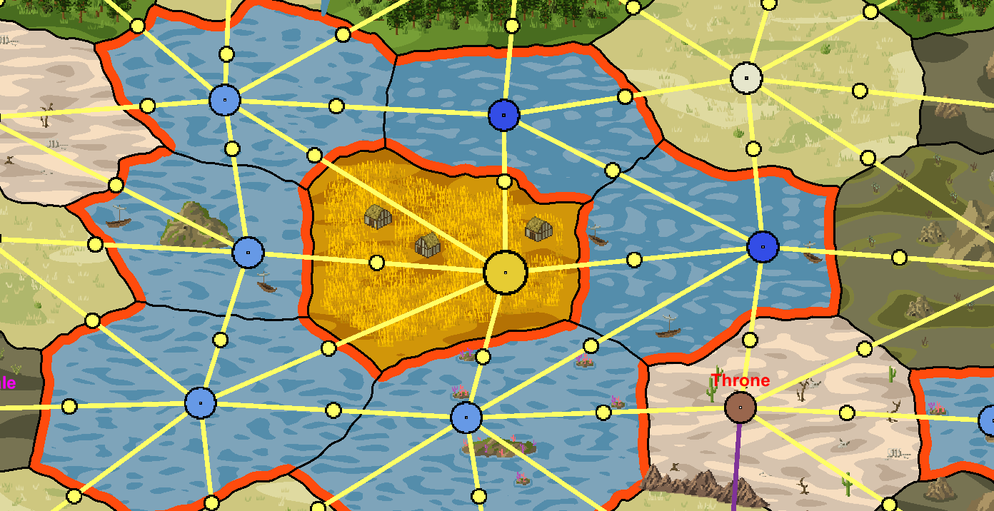
In Dominions you take are a powerful being that rules a nation and aspires to godhood. The player creates an avatar, known as a Pretender God, to represent them in the world. The type of Pretender God you can create varies from magically powerful arch mages to dragons, huge titans or large immobile monuments. When you start the game you decide what kind of god you are and how your Dominion affects your lands, followers and sacred soldiers. In order to win a game of Dominions, you must either eliminate all players, or capture a certain amount of thrones which are scattered around the map. Thrones are defended by powerful AI armies so you must be careful when seizing them.

There are currently 3 ways to play Dominions.

  1. You can play on a map which was hand-designed by somebody. These maps have the start positions for players and thrones placed manually by hand and typically have some sort of artwork made by hand. Maps like these can be uploaded to the Steam workshop. Since these maps are not randomly generated, you can memorize their layout. Some players might not have fair starting positions. There are a lot of variables that can make or break a handcrafted map.
  2. You can use the game’s built-in random map generator. Many people detest this tool because it has a tendency to not place the thrones fairly on the map. Ideally, all players should start off equidistant from each-other. Thrones should also be fairly distributed in a truly balanced game of Dominions.
  3. You can use Cartographic Revision, a closed-source third party map generator. This tool is much better than the default map generator. It places thrones fairly and it produces good looking maps. The logic it uses when determining province distribution and player start locations seems more robust.

Why make your own map generator?

Though I really like Cartographic Revision (it’s what inspired me to make this tool), it does have some downsides:

  • The user has no control over the generated map. You can’t edit manually alter anything once you’ve generated a map, what you see is what you get. This is a problem with the built-in Dominions map generator as well.
  • Certain player counts are unsupported. Do you have 11 players? You’re going to have to make a 12 player map and leave one of the player starts empty. This means a few players are going to have a vacant lot as a neighbor, which means they get some free real estate.
  • Cap rings are too random. A cap ring is the provinces adjacent to a player’s main starting castle. Castles draw resources from adjacent provinces. If you start with only 3 connected provinces, your income and available resources will be worse than that of another player who has 5 provinces in their cap ring. In Dominions the game balance is already dubious at best. Some nations are considered much stronger than others. Some nations are outright banned from games for being too powerful. My goal was to make every nation have 5 provinces in their cap ring so that no player ends up stuck with a bad starting position.
  • No roads. A road is a connection between provinces which reduces the movement cost between them, allowing armies to move further in a single turn. For reasons unknown to me, Cartographic Revision does not have these.
  • Certain combined province types, such as cave forests or reefs, don’t exist in Cartographic Revision. I planned to expose all available province modifiers in my map generator and allow the random generation to use them.
  • A memory leak causes Cartographic Revision to crash after you regenerate the map 3 or 4 times. Not the end of the world but slightly annoying at times.

Of all these reasons, the first is the highest value. Being able to manually tweak a generated map is extremely useful.

I had other goals in mind once I started planning my own map generator:

  • Make the map generator open ended so other people could add their own art styles to it. The ideal situation would be that the user chooses the art style from a dropdown menu. In the end I only partially accomplished this goal. There were enough bugs to fix and features to tweak in the original map generator art style that I never had time to focus on non-essential features.
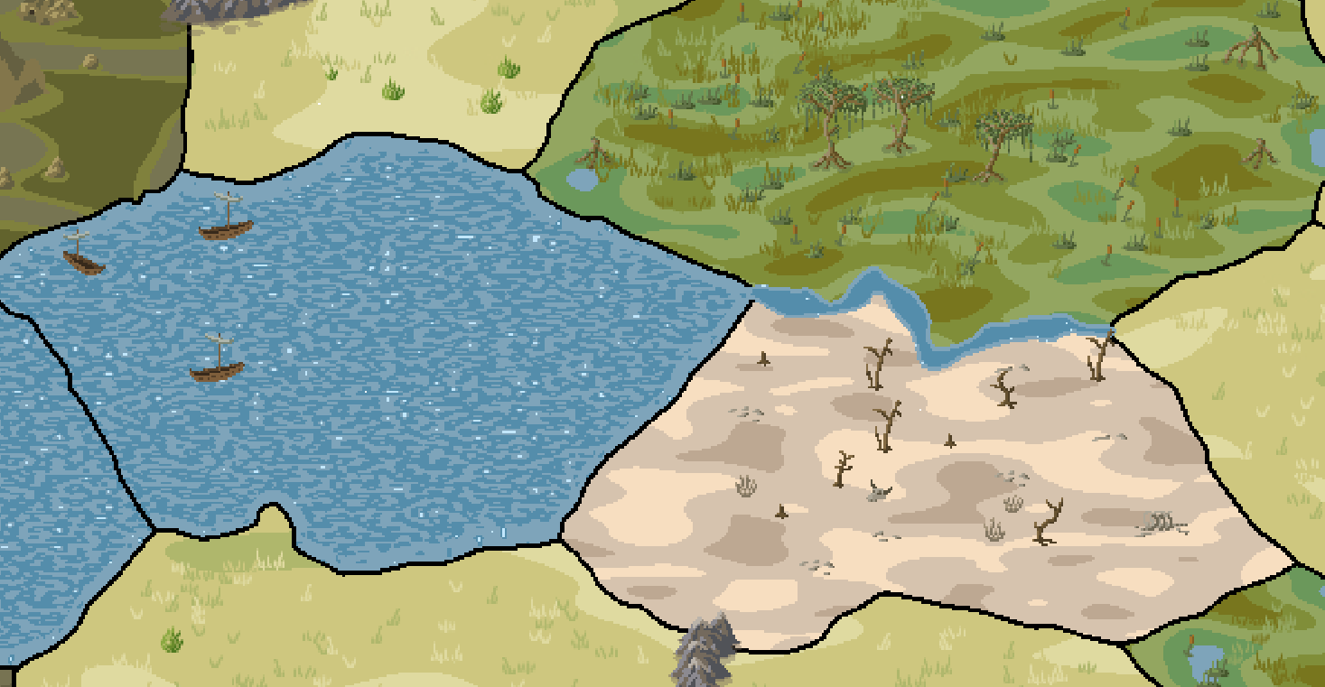
  • Make provinces have distinct visual cues. One thing i dislike is not being able to tell what attributes a province has at first glance. If a wasteland province has the warmer province attribute, then logically there should be cacti growing on it. If a plains province has the large province attribute, then it should have buildings scattered around which let the player know that it has a higher population than the average province.
  • Expose more options to the user. If the user wants to cluster water nations together to create one gigantic ocean, they should have the choice. Ideally i also wanted to expose everything to the user – what percentage of the provinces on the map will be forest, how often rivers and mountain passes are placed, and so-on.

From start to finish

Though Cartographic Revision is closed source, you could de-compile it to read the logic behind it. I personally don’t like doing this because it’s disrespecting the wishes of the creator and both of our map generators take a different approach to creating maps anyhow. Thus I made the conscious decision to not peek under the hood.

I documented everything from start to finish, partly for motivation and partly because I have a habit of keeping tabs on how things progress and what my thought process is at the time.

The very first functional map generator version was incredibly basic. Just a collection of nodes with player starts pseudo-randomly inserted. This obviously would not do. It was evident from first glance that player starts need to be static in order to be fair.

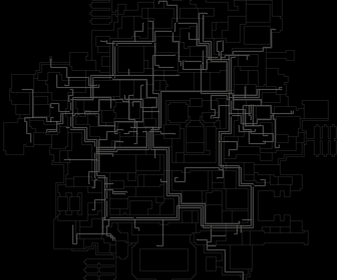
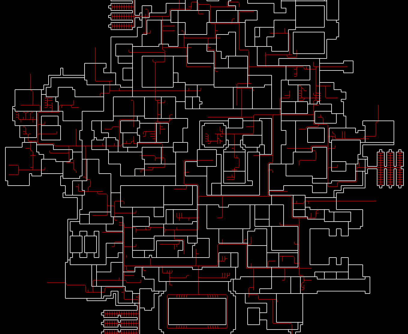
Next, I generated connections between nodes. Since the map has to wrap horizontally and vertically, there needs to be edge connections that wrap the far ends of the map together. I did not show these visually (yet) but they were programmed.

Next, nation data and world generation needed to be fleshed out. I hard-coded the types of provinces in the cap rings of each nation and added some logic for the sprinkling of different province types across all the nodes. Connection generation was also worked on. Rivers and cliffs are sprinkled between nodes to create interesting bottlenecks.

Next, support for some other player counts was added to test the speed of the map generation. For a 20 player map it only took about 0.3 seconds to finish.

At this point i was pretty confident that implementing manual province and connection editing was doable. All that was needed was a simple UI that allows the player to tweak the province flags and connection flags. The user clicks a node and the UI pops up.

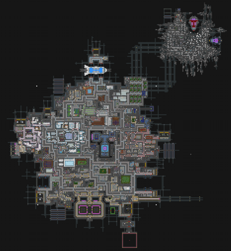
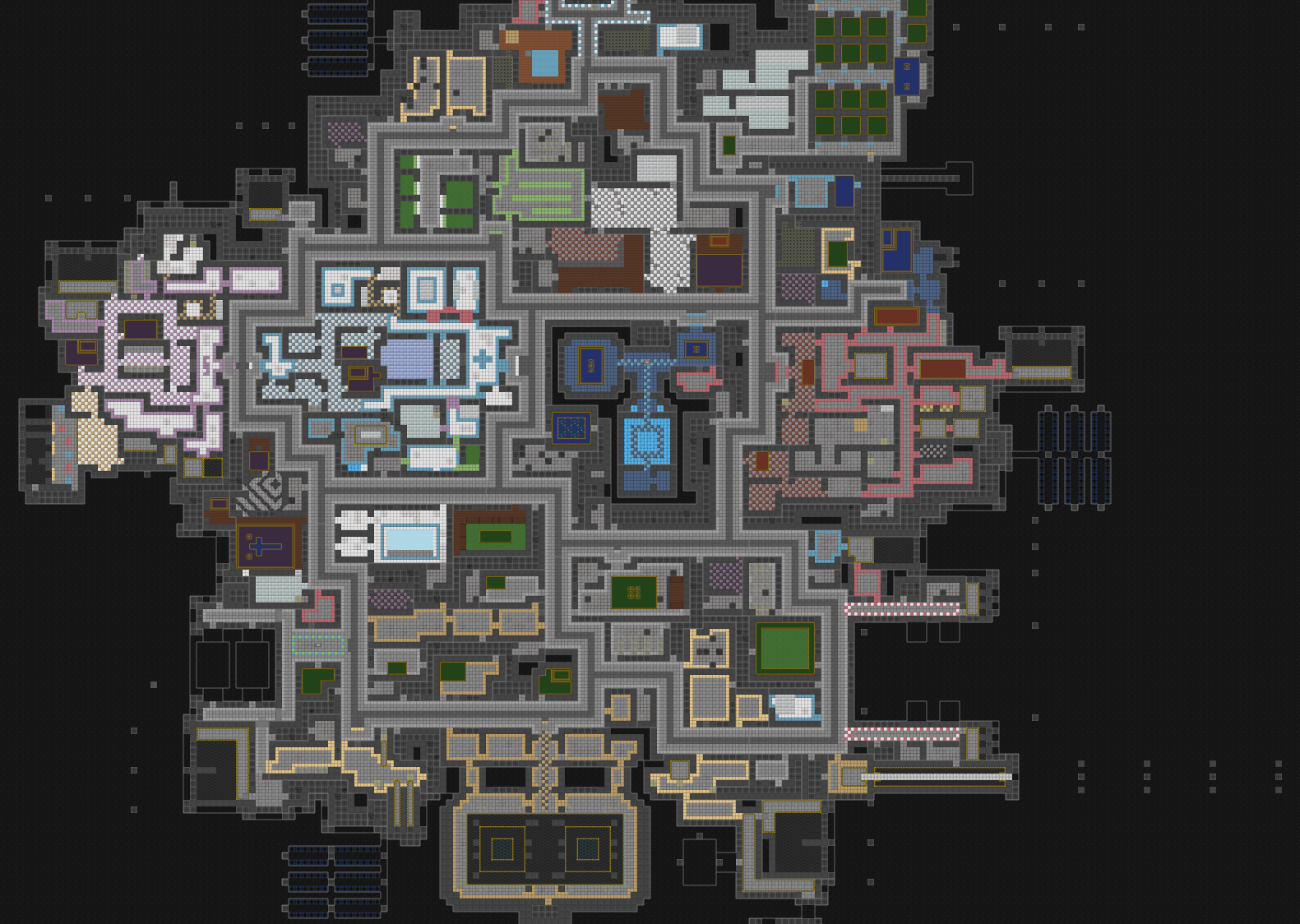
With simple province and connection editing finished, it was time to start introducing some randomness into the location of each province. The pink border represents the final dimensions of the map.

Next, I focused on making sure that the map would wrap properly along the seams. With 4 copies of the map tiled you can see there was one issue at the corner connection, but otherwise everything looked good.

With wrapping complete, it was time to start producing the actual provinces. My goal was to use simple meshes for all 2d polygon shapes.

The simple polygons don’t look very appealing, so next I worked on adding some randomness to the polygons, and improving the edge cases.

This looked better, but it still wasn’t good enough. Introducing random noise to a line between point A and point B will just give you a squiggly line. I wanted something more organic, so I started using bezier curves.

These shapes were definitely more interesting, though still too simple. The bezier curves needed more knots to make them more interesting.

These shapes were better, but not perfect. I finished the province wrap logic and started work on river and road polygons. It became immediately clear that complex bezier curves with a lot of knots from point A to point B resulted in the best organic looking shapes.

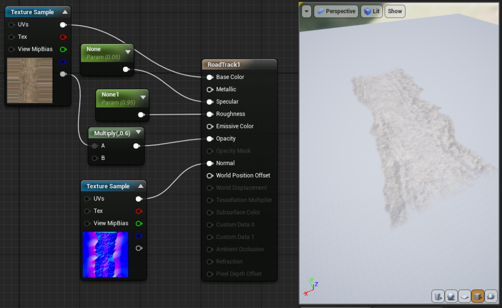
Roads did not need to be as complex, as long as they connected province A to province B.

One thing that was really important to me was visually obvious borders between provinces. I used line renderers to highlight polygon edges.

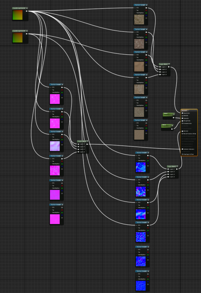
Next, I worked on making some shaders for the province polygons to make them look more like terrain. Using a perlin noise shader, it was easy to make my provinces look similar to the ones generated by Cartographic Revision.

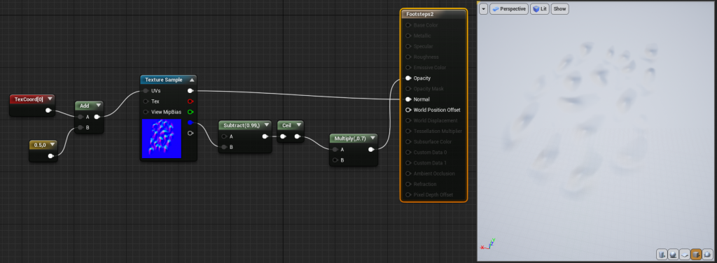
With province shaders finished, i started work on sprite placement. This was the most costly process in terms of processing power required. In order to properly find all valid sprite positions inside of a province polygon, i do hundreds of ray-traces downward onto the polygon. If the ray hits, it’s added to a list of valid sprite positions. Doing this across the entire map takes time but I was pleased with the end result. I took a mental note that this process could likely be optimized in the future.

With my approach, I am placing meshes and sprites in front of a static camera which then renders what it sees to a RenderTexture. This texture can then be read and output as the final product. I also display this texture off to the side next to the meshes and sprites, so the user can see the interactive nodes, and also look at the map as it would appear without them.

In order to organize sprites properly and make it easy to tweak, I exposed everything to the Unity editor UI. There are plenty of options for each sprite which help determine its color, chances of being placed, space taken, and terrain which it can be considered valid for.

Connections between provinces also need to place sprites in some cases. A mountain pass has specific rules to create a dip in the middle to show the players that it can be traversed. I also introduced more jitter to the province polygons to give them a more organic shape.

At this point my main concern was creating sprites for all different terrain types.

Each sprite requires a summer and winter version, since the seasons do change in Dominions. Provinces also require a different colored shader for winter.

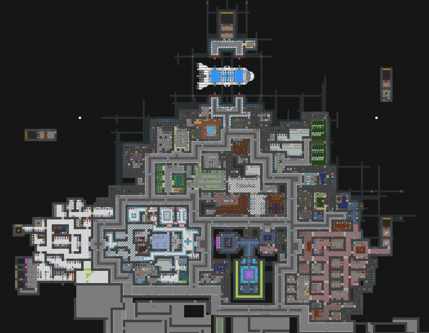
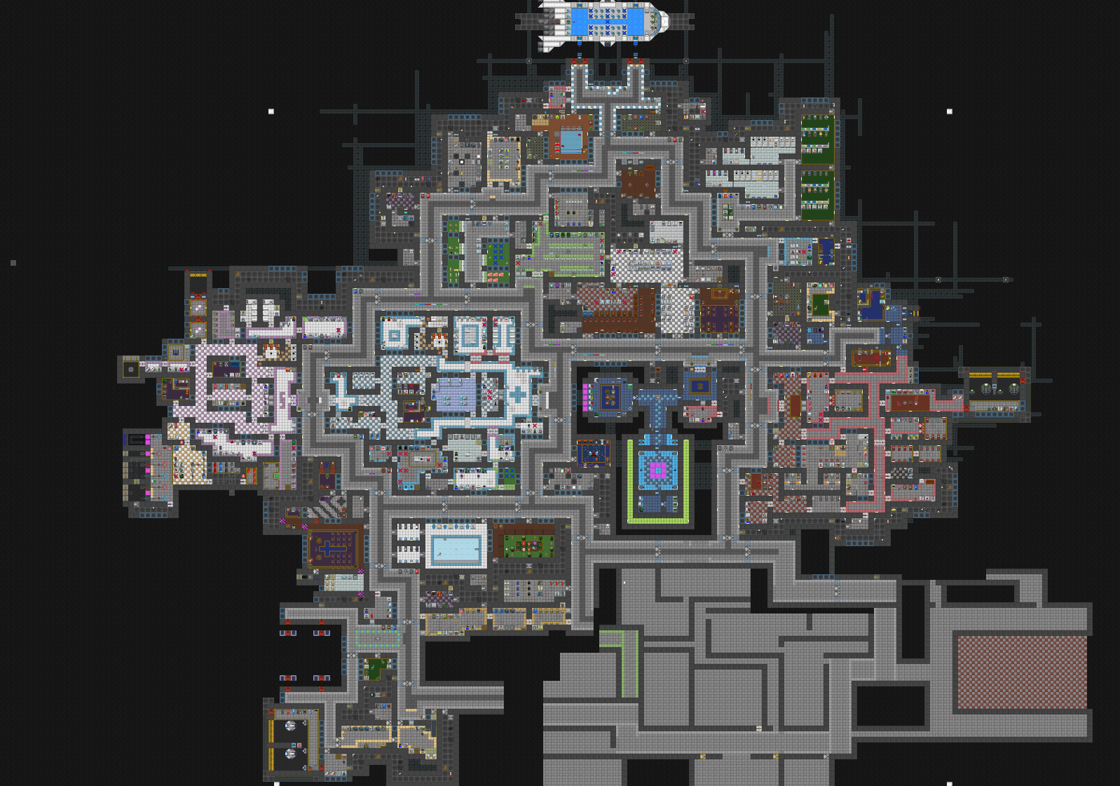
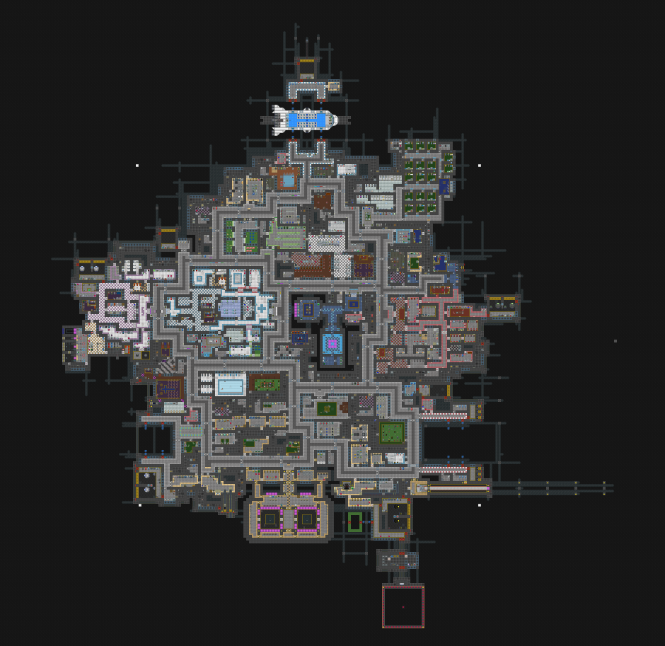
Once all the basic artwork was complete, the next step was writing the output logic. All map information such as province connections and terrain information is stored as plaintext in a .MAP file. The coordinates of pixels that belong to a given province are also stored in this file. Testing this output meant you had to output the map, then open it in the built-in Dominions map editor to visually inspect it.

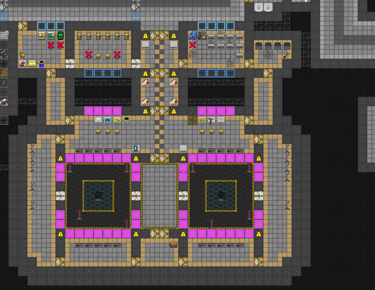
Finally, I had to figure out fair layouts for the oddball playercounts. For 16 players it is trivial to organize the player starts into a 4×4 grid. Each player gets 4×4 provinces to themselves, which means 15 normal provinces and 1 throne.

How do you do this with 17 players? I had to start playing around with grids in MSPaint to solve this. Green squares are player starts, blue squares are potential provinces that would be in their cap ring, and purple squares are thrones. Some liberties had to be taken, for example, the center player may possibly have a slight advantage in terms of available real estate and nearby thrones. I tried to balance this by giving other players thrones that are closer to their cap ring.

Once I was happy with the grid layout, I could use the grid as a reference to figure out the coordinates of player starts and throne positions.

And that was it! With support for all player counts, I could output maps of any size.

The gritty details

I kind of glossed over some of the more technical stuff, so I’ll try and explain some of the more complex aspects of this tool in detail.

Province polygons

In order to create a group of provinces that connect without gaps, I had to figure out the shared borders between provinces.

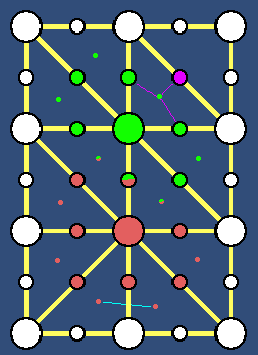
In this example, let’s focus on the 2 large colored province nodes. A province border can’t just use each connection center (the second smallest dots) as a corner. The borders are determined by taking all the connections that form triangles and computing the triangle center. The pink lines show this in action. The pink connection dot and its neighboring green connection dots form a triangle, so I compute their center point. This point belongs to all 3 of those connections. If this logic is repeated across the entire set of connections, each connection will have 2 neighboring triangle center points that are relevant to it. If you traverse through the connections belonging to a province node and connect their triangle center points, you form a polygon. Repeat this logic for all province nodes and you have a collection of province polygons perfectly connected without gaps.

Since in this case the grid of nodes are equidistant, the resulting polygon will be a predictable shape. I make several tweaks to get a more interesting result:

  1. Deform the grid a little bit by applying random jitter to the province positions (being careful not to overdo it).
  2. Make the polygon borders more interesting by using bezier curves.
  3. Adjust the connections based on the traits of their nodes. For example, if the green province had a small province flag assigned, then it would pull the center of its associated connections towards it slightly, resulting in a smaller polygon.

Sprite placement

There is a specific order in which things are generated when a new map is created.

  1. Generate the conceptual information (a simple grid of conceptual nodes and connections) and assign terrain data.
  2. Place the actual unity objects in the scene and assign the conceptual data to these objects, taking care to keep the conceptual and unity object logic separate.
  3. Compute the meshes to be used by each province and connection.
  4. Compute valid sprite placement positions for each mesh.
  5. Place all sprites.
  6. Assign sorting order to sprites (so sprites render in the proper order).

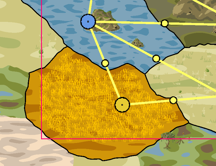
This farmland province is on the bottom left of the map, so parts of its mesh fall outside of the map border. I ignore the outer portions of the mesh since they won’t appear on the final outputted image.

In order to determine positions where sprites can be placed, I compute the bounding box of the mesh and trace hundreds of rays within that bounding box. I resize the bounding box if it falls outside of the red border to avoid unneeded raycasts. If the ray collides with the mesh, it’s a valid position. If the ray collides with a different mesh, it’s an invalid position.

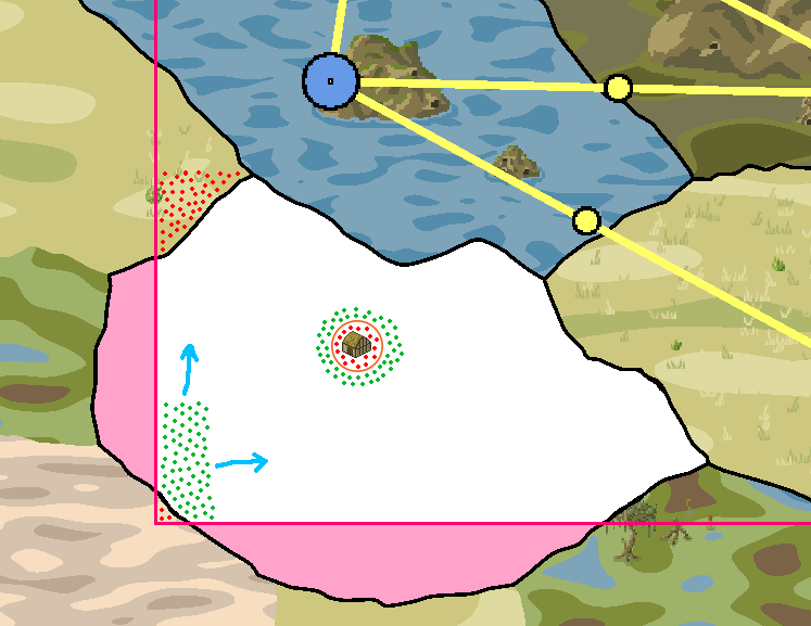
I apply a small amount of jitter to the start position of the ray so that the sprites don’t appear to be placed uniformly. Green dots are valid points and red dots are invalid.

Once the set of green points is determined, I start placing sprites. When a sprite is placed, it deletes all other potential sprite placement points within a certain radius of itself. In the diagram, a farm house would clear out all the nearby positions so that the wheat doesn’t get placed too close to it. Each province type has different settings. Farmland places wheat sprites very densely, so it uses almost all of the computed sprite positions. Other provinces such as wastelands don’t need to place a lot of sprites, so they require less positions.

Province textures

I use a very simple set of perlin noise shaders to give the provinces their texture.

There are a few parameters i have control over in each material:

  • X/Y randomization seed (this is mostly unused since most of the shaders use different scaling anyhow)
  • X/Y scale. This determines how squashed the blobs are. With an X scale of 1.0 and a Y scale of 0.3, the blobs become vertically squashed to give the feeling of perspective. With an X and Y scale of 0.01, the blobs become very small and the texture looks grainy, almost like the white noise you’d see on a tv screen.
  • Colors. There can be anywhere from 2 to 5 different colors used.
  • Thresholds. Each pixel computed by the shader has a perlin noise value that ranges from 0 to 1. The thresholds determine what range of values will belong to a certain color. In the plains province shader, values from 0 to 0.35 result in off-white, values from 0.35 to 0.75 result in pale yellow, and values from 0.75 to 1 result in green. These thresholds can be tweaked to increase or decrease the size of the off-white and green blobs.

That’s all there is to it. Each province type has a texture for summer and winter, and typically the only thing that differs between these textures is the color palette used.

Shorelines

My water shaders alone didn’t look very convincing so i used line renderers to add shorelines to the rivers and seas. In order to make it look good without overlapping onto land with the line renderers, i used modified versions of the perlin noise shader that makes use of stencil buffers. The logic is simple, any edge line that borders a body of water will create one line renderer for the black edge line, and one line renderer for the shoreline. Unity line renderers use 2d meshes to draw the line, so materials and shaders can be assigned to them.

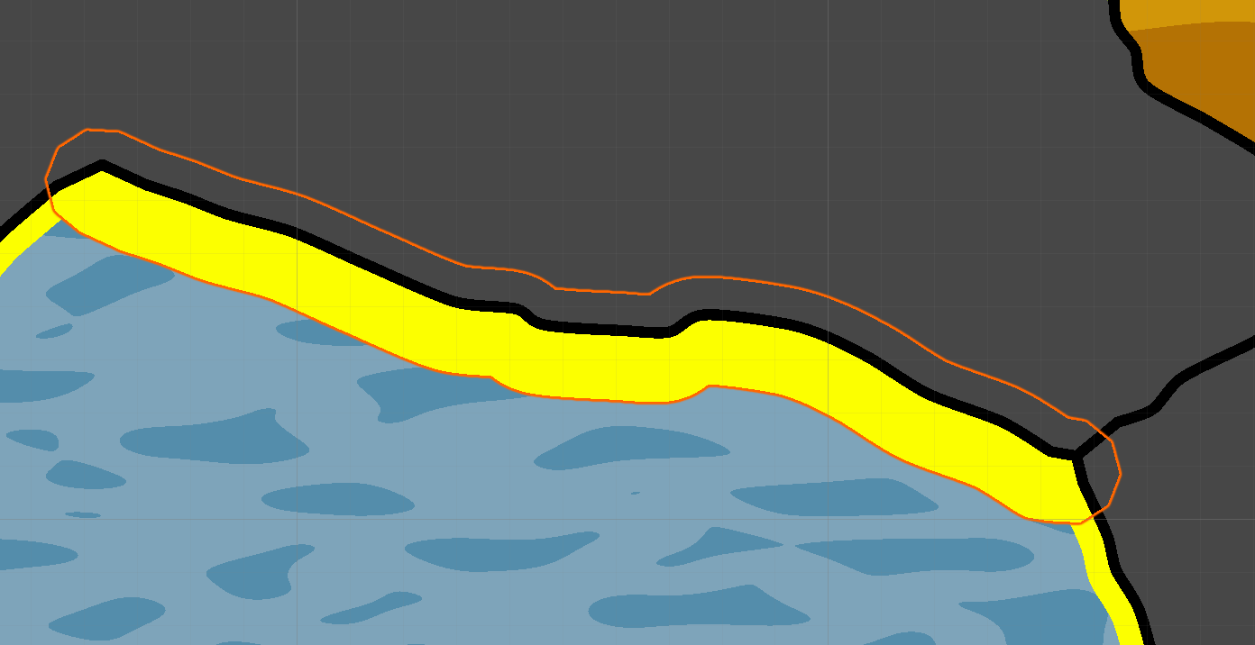
Once i had the stencil buffers working, i could put the shorelines on every connection that touches a water province.

And with shorelines working properly, the water shaders could be tweaked to look a bit more realistic. I also used these shorelines on the river meshes since they looked so good.

And there you have it, low-effort shorelines.

What’s next?

I’m keeping track of my to-do list on the github page for this project. It’s mostly been whittled down to the non-essential features at this point.

I made the choice to make this open-source because I believe that the sprite art could be revised by someone more artistically inclined. There’s certainly a lot of ways that the world generation could be optimized as well. In the long run this tool can only benefit from more pairs of eyes looking through the code and finding ways to improve it.

You can download this tool for free on itch.io.

Glitch Art

This was a fun little experiment I did using Openframeworks. I saw some glitch art made by Adam Ferriss and decided to give it a try myself. I set up a simple program which loads an image. Pressing “Q” would apply a series of operations on the entire image, such as swapping pixels if a condition is met, altering the color of certain pixels, etc.

I wrote several different algorithms that resulted in some cool results. I was also able to capture some of these algorithms in action since they were so interesting to watch.

I rewrote this program using Unity and tidied up the code, however it unfortunately runs much slower than it did in Openframeworks.


Arena Simulator

I created a Unity game that simulates a Hunger Games sort of scenario. The idea was to make it as modular as possible so that users could control virtually everything about the characters, weapons, and arena via XML.

For example, the user can create different types of bodies and define each body part. The body is organized as a tree, so in a human body if a pawn’s leg were destroyed then it would follow that their shin and foot would become unusable. Here’s an excerpt from a human body definition:

<BodyPart Name="Left Eye" ParentName="Head">
	<MaxHealth>3</MaxHealth>
	<IsRoot>false</IsRoot>
	<IsBranch>false</IsBranch>
	<CapacityFactors>
		<CapacityFactor>
			<CapacityName>Sight</CapacityName>
			<Factor>0.5</Factor>
			<WeakLink>false</WeakLink>
			<Influences>
				<DamageType>Any</DamageType>
			</Influences>
		</CapacityFactor>
		<CapacityFactor>
			<CapacityName>Pain</CapacityName>
			<Factor>0.7</Factor>
			<WeakLink>false</WeakLink>
			<Influences>
				<DamageType>Any</DamageType>
			</Influences>
		</CapacityFactor>
		<CapacityFactor>
			<CapacityName>Manipulation</CapacityName>
			<Factor>0.5</Factor>
			<WeakLink>false</WeakLink>
			<Influences>
				<DamageType>Any</DamageType>
			</Influences>
		</CapacityFactor>
	</CapacityFactors>
</BodyPart>

An example of a capacity modifier:

<CapacityMod Name="Steadfast">
	<CapacityName>"Pain"</CapacityName>
	<Description>"You handle pain better than most people."</Description>
	<Modifier>2.5</Modifier>
</CapacityMod>

Each body part can affect the capacities of a pawn. The eye body part affects the sight capacity by a factor of 0.5, which is to say that if a pawn has its eye destroyed, its sight becomes 50% worse. If both eyes are destroyed, its sight capacity falls to 0%, which affects its abilities in combat and so-on.

An example of a weapon:

<Weapon Name="Lead Pipe">
	<Usefulness>8</Usefulness>
	<Damage>8</Damage>
	<Range>0.6</Range>
	<AttackSpeed>1.2</AttackSpeed>
	<DamageType>Blunt</DamageType>
	<IsRanged>false</IsRanged>
	<MissText>%PAWN swings their lead pipe at %ENEMY, but misses</MissText>
	<DestroyText>%PAWN crushes %ENEMY's %PART</DestroyText>
	<DamageText>%PAWN clubs %ENEMY in the %PART with a pipe</DamageText>
	<KillText>%PAWN beats %ENEMY to death with a lead pipe</KillText>
</Weapon>

Usefulness determines whether a pawn should prioritize a weapon (for example, a lead pipe is vastly preferable to a flimsy stick).

An example of a character:

<Character Name="Johan">
	<Attributes/>
	<Aspects>
		<Aspect>Clumsy</Aspect>
	</Aspects>
	<Competencies>
		<Competency Name="Strength" Value="4"/>
		<Competency Name="Marksmanship" Value="7"/>
		<Competency Name="Vitality" Value="3"/>
		<Competency Name="Constitution" Value="5"/>
		<Competency Name="Dexterity" Value="4"/>
	</Competencies>
</Character>

There is also a built-in editor for existing characters, however it lacks the ability to modify the aspects assigned to a character.

The map is a dynamically generated mesh using the Unity terrain object. Patches of dirt and sand are added using simplex noise to determine which vertices have which texture. Objects are scattered on spots all over the map using raytraces. There’s a day/night cycle where the amount of light affects the visibility on the map, and therefore how effective some pawns will be with their weapons. There’s also a set of controls on the top left which allow the user to speed up time, pause, check the event log and open the stats of a specific pawn.

The action log allows the user to see exactly what is happening, in depth. The character inspector lets them see the vital stats of characters and their current action.


This is technically abandoned although with a bit more polish i think it would be something worth releasing. In its current state it still needs some work.

Blender Stuff

Way back when Team Fortress 2 was popular, I decided to mess around with creating cosmetic items in Blender. None of it really went very far but i learned a lot about the Blender workflow.

Hits N Giggles

A culminating group project done for a game dev course. It was a lot of fun to work on and was a resounding success.

Features:

  • Local multiplayer with support for 4 usb controllers as well as keyboard WASD/arrow keys.
  • 2 playable characters with their own unique look and different abilities.
  • A “comeback mechanic” where you get a special weapon when you have 25% health. the rabbit gets throwable bottles in place of his melee attack, the bear gets a hammer with more knockback and damage.
  • Robust physics prop/gibs system. Props can be thrown at other players and have their own unique properties. Crates will sometimes contain other props.
  • 2 functional maps, each with their own unique hazards and traps.
  • Music player that plays the music in the game music folder, you can replace the included music with your own if you want.

The alpha demo:

The final product:

You can download it here.

Space Frog

For an assignment I had to make an asteroids clone. I kept track of my progress with some videos. For fun i added some procedural parallax clouds.

Room Generation

Here are some screenshots of a room generation algorithm i wrote in action.

The idea behind it is simple enough but there are a lot of things that can go wrong in the process. It took the most time to make this algorithm robust since ~10% of the time it would generate disjoint rooms. Here is the process:

  1. Start with a grid of blue tiles.
  2. Hollow out some grey rooms randomly, using some constraints such as max/min room size. Rooms should not touch.
  3. Create corridors between rooms. For each room we make one or more corridors (also based on constraints that we can change) to another room. When creating corridors, we have to make sure the tiles on either side of the corridor are blue or else we end up with corridors merging. We also need to ensure the corridor doesn’t attach to a  room corner (since corridors are 2 tiles wide).
  4. Check each room and make sure it can be reached by all other rooms. If one room can’t be reached, discard all corridors and generate them again until a configuration is reached which satisfies this constraint.


The more variables you expose, the more interesting configurations you can get. The leftmost image has smaller rooms with a higher chance to have several corridors per room, the rightmost has larger rooms with less corridors.

Cellular Automata

This was a little test project I made to experiment with cellular automata.

Simplex noise can be a very useful tool for accomplishing the same result, but it’s nowhere near as customizable (or fun) as cellular automata.

Here is how it works (i had a rough idea of how this works beforehand but this is for those who might be interested):

1. Create a 2d grid of tiles. turn roughly 50% of them red, at random. Depending on the rules you choose for the cellular automata, you may need to tweak this to be closer to 40% or 60%.

2. Decide on the rules you want to use for each tile. To make this a little easier to understand, imagine that each tile is a living organism like bacteria or something. The organism will either die or expand to other tiles based on its rules. The classic “5-4” rule is as follows: a white tile becomes red if 5 or more of the 8 tiles surrounding it are red. A red tile becomes white if less than 4 of the tiles around it are red. We are basically saying: a bacteria starves to death if it is surrounded by less than 4 other ones, and an empty space spawns a new bacteria if it is surrounded by at least 5 others.

3. Apply the rules to each tile. In order to get desirable results, these rules need to be applied several times in a row. Over time, the cells will shift into a random, unique shape based on the rules you applied in each iteration.

That’s it. The above image is what i got from applying the 5-4 rule 5 times in a row to a grid of 50% white and red tiles.

…But it gets more interesting. We can change the rules to get vastly different results. We can also use different rules with each iteration. For example, we could apply a given rule 3 times, then change the rules and apply the new set of rules 5 times in order to get a totally unique result. The image in the bottom right shows some of the stuff i ended up with using different rule sets. You will also get different results depending on how many iterations you do. There’s an infinite amount of combinations of rules and iterations you can do which makes this a very cool method to use for generating worlds.

In my situation, i wanted to generate a world where there is only one main area (ie, no smaller disconnected white areas that can’t be reached from the main white area). In order to do this i have to first generate the world, then check each white area using a flood fill algorithm (kind of like the bucket fill tool in mspaint) to see what percentage of space in the world each area takes up. In the bottom left you can see this in action. The blue area is the main area and the green areas are the smaller detached areas we want to get rid of. The blue area takes up roughly 40% to 60% of the world space so it is easy to tell which ones are small and need to be discarded (the green ones). In the case that the main area takes up less than 40% of the grid we can always just scramble the grid and start over.

The most popular use of cellular automata is conway’s game of life. Check it out if you wanna play around with this stuff in your browser.

If you are interested in programming something using cellular automata, this page is extremely helpful.

Tile-Based Untitled Game #2

This project was a sort of continuation of my other chunk-based grid project i created in MonoGame.

This one uses simplex noise combined with an ‘infinite’ chunk-based game grid. You can see where the chunks connect. There are 9 chunks in the grid and you start in the middle. If you move to an edge chunk, that chunk becomes the center and the chunks which are not immediately on the edge of it are erased and moved to become the new edges.

Combined with saving/loading the entities within a chunk, this means i could create massive procedurally generated persistent grids.

The 3 images show the difference between using different octaves with simplex noise (the leftmost image uses 8 octaves). I started work on generating cliffs (the orange outlines on the right image) but it’s going to take a different algorithm to properly generate cliff edges.

Here is some working on cliff generation, specifically marking the edges properly. To properly illustrate chunk boundaries, I made the chunk colors alternate between grey and white.

The top image is the initial cliff edge marking (any tan tile connected to a white tile becomes orange).

The second image shows the second pass where i convert all white tiles with 2 orange tile connections into an orange tile. This method actually gives worse results and causes large gaps between cliffs segments in different chunks.

The third image shows a tweaked version of the method used in the second. I am converting tan tiles to orange instead of white tiles to orange. It gives significantly more accurate results, still a few gaps to sort out though. I am missing a specific case related to chunk edges.

This simple method i am using works well. I originally used the marching squares algorithm to mark the edges of the tan blobs but it would have taken a lot of tweaking in order for it to give the proper results.