Space Station 13 is a brilliant game concept. It was originally created in 2003 using the BYOND engine. A more detailed (and in my opinion, very interesting) accounting of the history of Space Station 13 can be found here. The jist of it is that the source code for Space Station 13 was released to the general public. Not long after that, several communities were created, each with their own branch of the code with their own features and ideas for how the game should play.
The concept is simple:
- Take 80 players, give each of them a job, and stick them on a space station.
- Pick a random game concept from a hat and activate it. Maybe one player becomes an alien that has to stealthily absorb the DNA of several crew members and escape the station safely. Maybe several players are designated as rogue operatives who have to set off a nuke in the station engine room. Maybe several players are given a specific task or target to assassinate.
- Watch as the space station slowly descends into utter chaos until it becomes so bad that an evac shuttle has to be called. Generally this happens within a half hour, depending on how chaotic things get. Once the station becomes too unsafe and too many staff members are dead or at risk of death, the station commander will call the shuttle.
- Once the station is evacuated, reveal what the game was and who won.
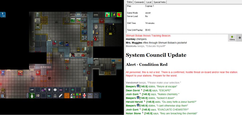
What makes this formula work is that Space Station 13 has a lot of depth. It is first and foremost an atmospheric simulator. If a room is breached and exposed to outer space, it quickly becomes freezing cold and players without a breathing apparatus will suffocate.
In addition to simulating the atmosphere everywhere in the station, the game allows players to interact with damn near every entity on the station in nearly every conceivable way. You can inject light bulbs with highly flammable liquids and watch as the hallway bursts into flame when someone turns the light on. You can spike someone’s water with LSD. You can open the maintenance hatch on an APC and snip some wires to disable the power for an entire section of the station. You can open the maintenance panel on an airlock, engage its locks, disable its power, then weld it shut for good measure. You can tear up the floor tiles and reroute the garbage chute so it empties trash into the captain’s quarters. Any nefarious thing you can think of is probably possible in this game.
Since Space Station 13 grants players such a large degree of freedom, there’s a lot of potential for abuse. There are a lot of rules that players have to abide by or face discipline from an administrator for a particular server. For example, players who have not been designated as a rogue operative get in trouble for murdering people freely. The idea is that you’re supposed to act in good faith. If you sign up as a janitor, then you’re expected to at least spend a bit of time keeping the station tidy. As long as you don’t ruin the game for other players or break certain rules you are free to do whatever you please. It is for this reason that every game of Space Station 13 ends up being something different and interesting. Every game has its own story and every player plays a part in determining the outcome of the round.
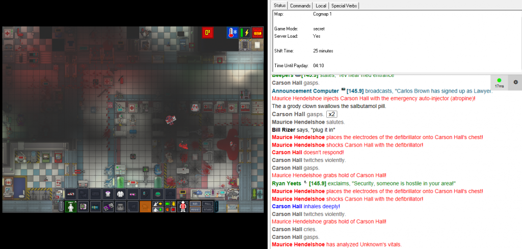
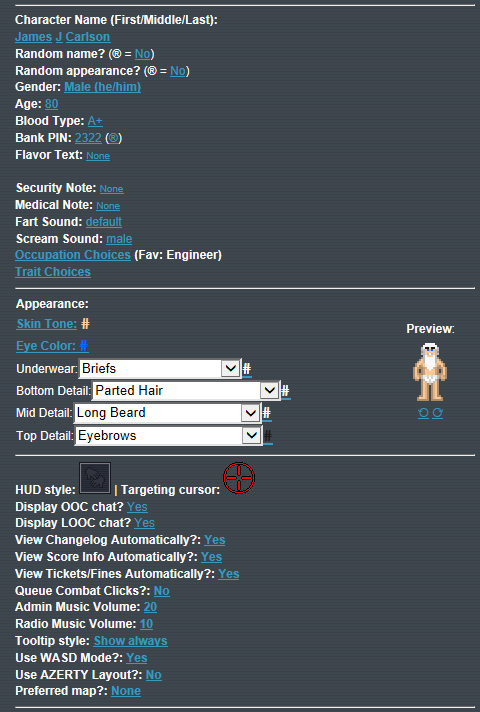
Players are also expected to roleplay a bit, since everything is described through text. You are allowed to create your character as you see fit and choose which jobs you would prefer to do.
All players are equipped with a radio headset and can choose to talk into the headset or chat with the person next to them. There is an incredible amount of depth to the communications system, communication is a critical element of the gameplay. If you lose your radio headset, you have to rely on wall-mounted intercoms to communicate over the station radio channels. If someone steals your headset then welds you into a locker, all you can do is scream for help and hope some player nearby can hear you.
The station
I enjoy playing SS13 a lot, but what really caught my eye is the level of detail that goes into the space station itself. Every aspect of the station has to be carefully considered for both aesthetics and gameplay purposes.
Here is an overview of what people consider the gold standard for space stations currently. Players vote for this map the most often because it plays exceptionally well and is aesthetically pleasing. But what makes a map good? There are a lot of design considerations a map needs to tackle while still looking good.
- The medbay needs to be somewhat central and accessible. Players will inevitably get injured and if medical facilities are too inaccessible, injuries will turn into deaths. Often a map will also have small medical hubs in the areas that are too far from the medbay.
- The security sector needs to be somewhat central as well, because players will misbehave and if security officers can’t deal with them easily, the station will fall into anarchy.
- The bridge and station AI room need to be well protected. If they get destroyed, the station becomes a much more dangerous place.
- There are lots of non-essential rooms that should still be fairly exposed to major traffic arteries, since otherwise players will never visit them. A good station has many social hubs where players will naturally end up visiting since you want to force interactions between players for the station to stay interesting.
These are just a fraction of the considerations that have to be made.
The plan
Before starting any work I had to figure out how I wanted to approach the design. Every person that makes a space station has their own ideas of what it needs to look like. Making a space station is a lot of work so planning ahead is a no brainer. Having to redo vast portions of the station is not a good problem to have.
I started by drawing my layout roughly on graph paper.
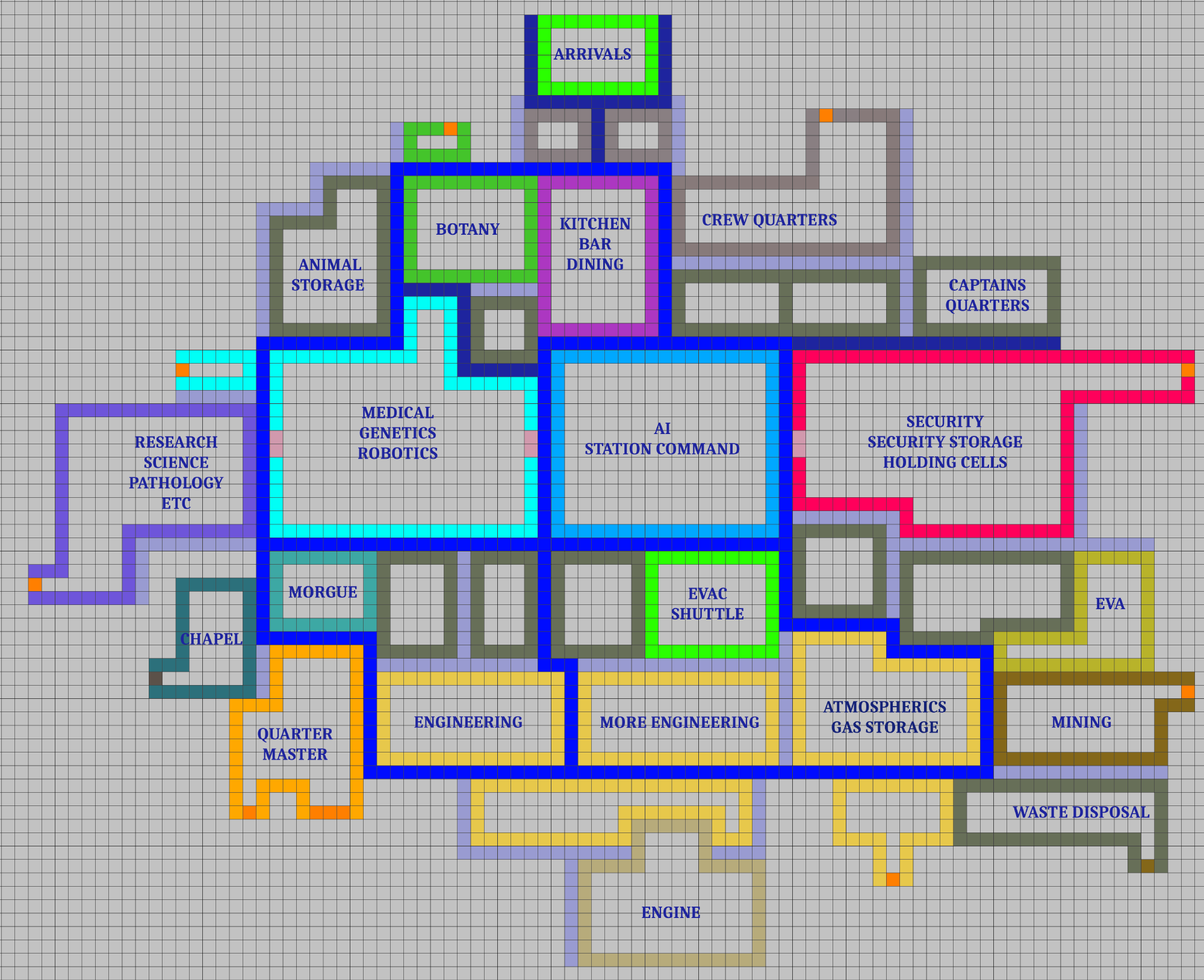
I wanted the station to have more looping hallways than other existing stations. Instead of being one main root hallway with a bunch of branches, the station would instead have a web of interconnected hallways. The dark blue tiles represent these hallways in the image.
I had several principles in mind when i started creating the layout:
- No room will be larger than the player screen size. If a department has more space than that, then it needs to be properly partitioned.
- Main hallways should be 4 tiles wide, secondary hallways should be 3 tiles wide, maintenance tunnels should be 1-2 tiles wide.
- The research sector and engine should be kept on the external fringes of the station since they’re the most likely to cause catastrophic damage. The engine that powers the station is powered by a small black hole and nefarious players can unleash this mini singularity and watch as it moves around and randomly destroys sections of the station.
- Social hubs such as the bar and cafeteria should be near the center of the station. Medbay and security should also get prime real estate.
- The map needs to be aesthetically pleasing but also designed in a way that uses the least amount of space possible and promotes good gameplay. This can be harder than it sounds, sometimes the best looking solution isn’t always the one that players will enjoy.
From start to finish
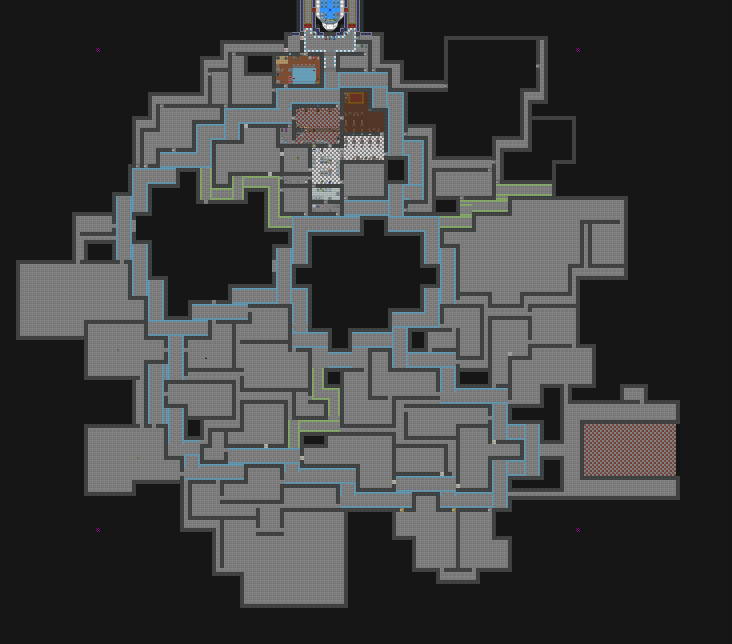
With the rough draft finished, i started working on the actual map. The first step was to create the rough footprint for the walls and floors. There’s a few changes i made right off the bat that contradicted my original drawn plan. I moved the evacuation shuttle to the southeast corner and rearranged a few other departments.
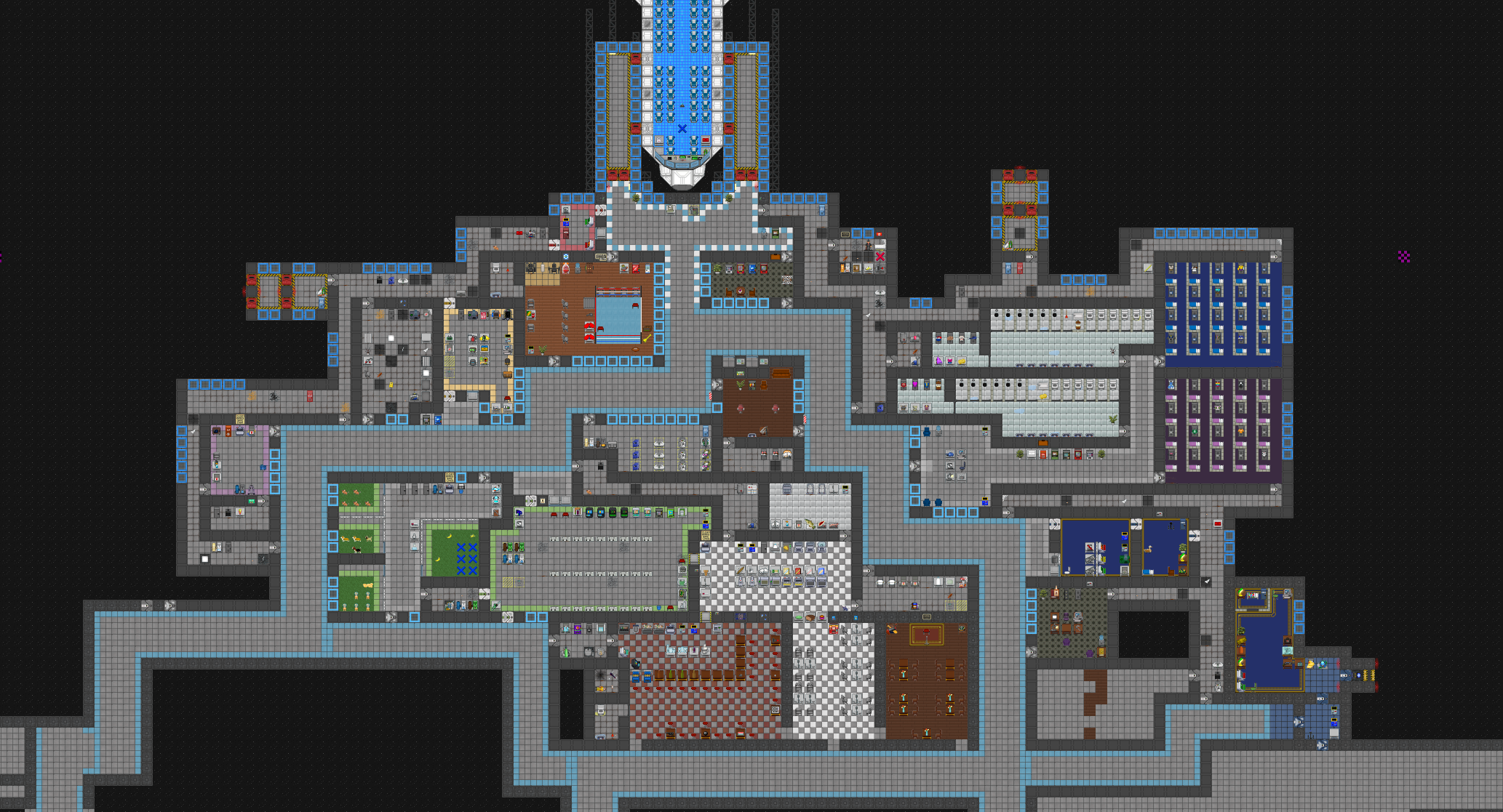
My approach to designing the map was to start at the top and work downwards. If i needed to resize a department for any reason, i could simply add or subtract space from its southern neighbor. The arrivals shuttle, botany, animal storage, kitchen, bar, jazz lounge, rec room, crew quarters, tool storage, head of personnel and captain’s quarters were the first departments i worked on.
My first attempt at making the security department was an overwhelming failure. The layout of the department was too clunky. The brig was exposed to the main hallway which meant jailbreaks would be common. The layout of the rooms was clunky and maze-like.
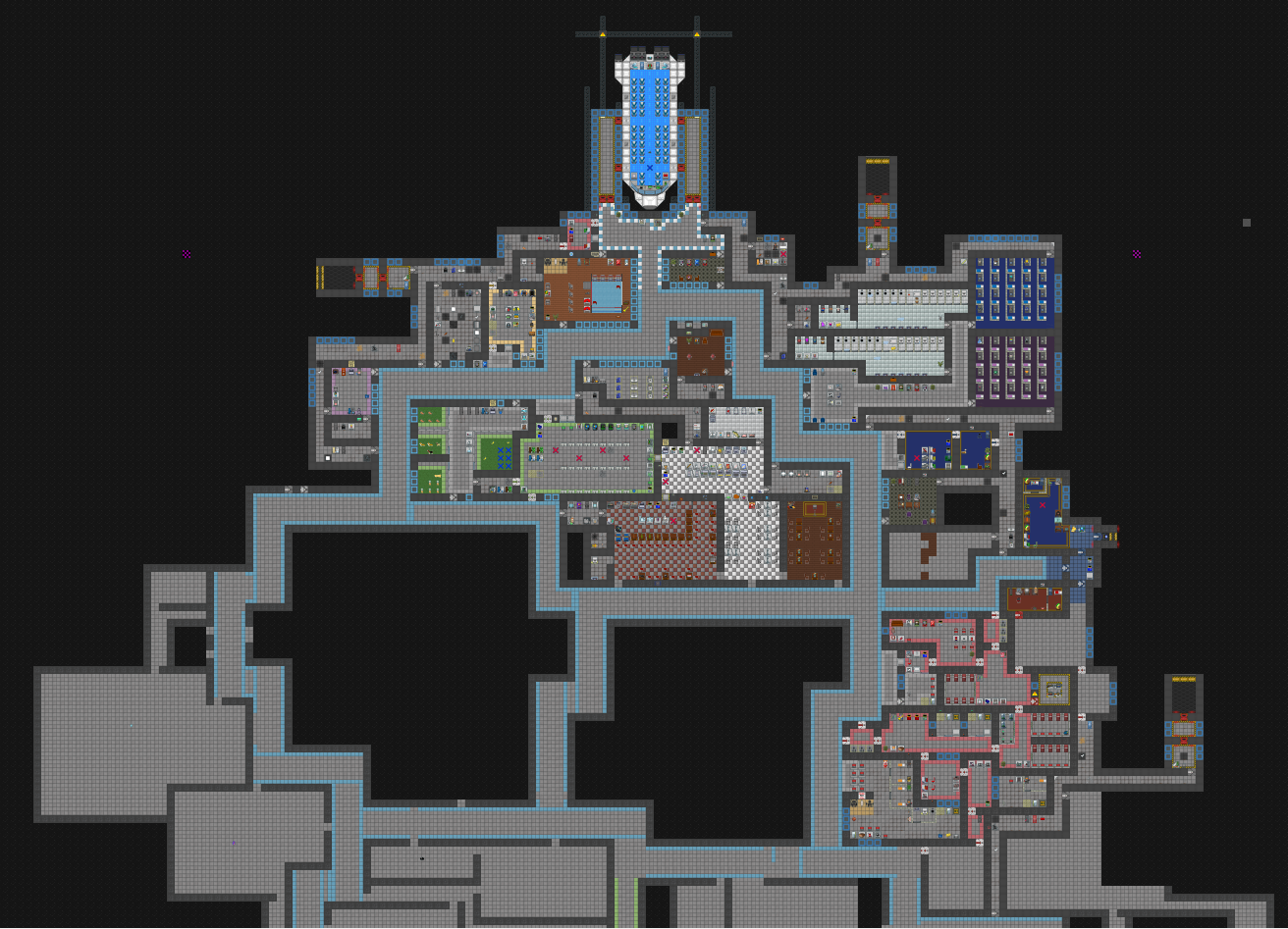
I continued to revise rooms. Crew quarters was really poorly set up so i gutted it and started over. Security underwent 3 revisions before i was satisfied with it.
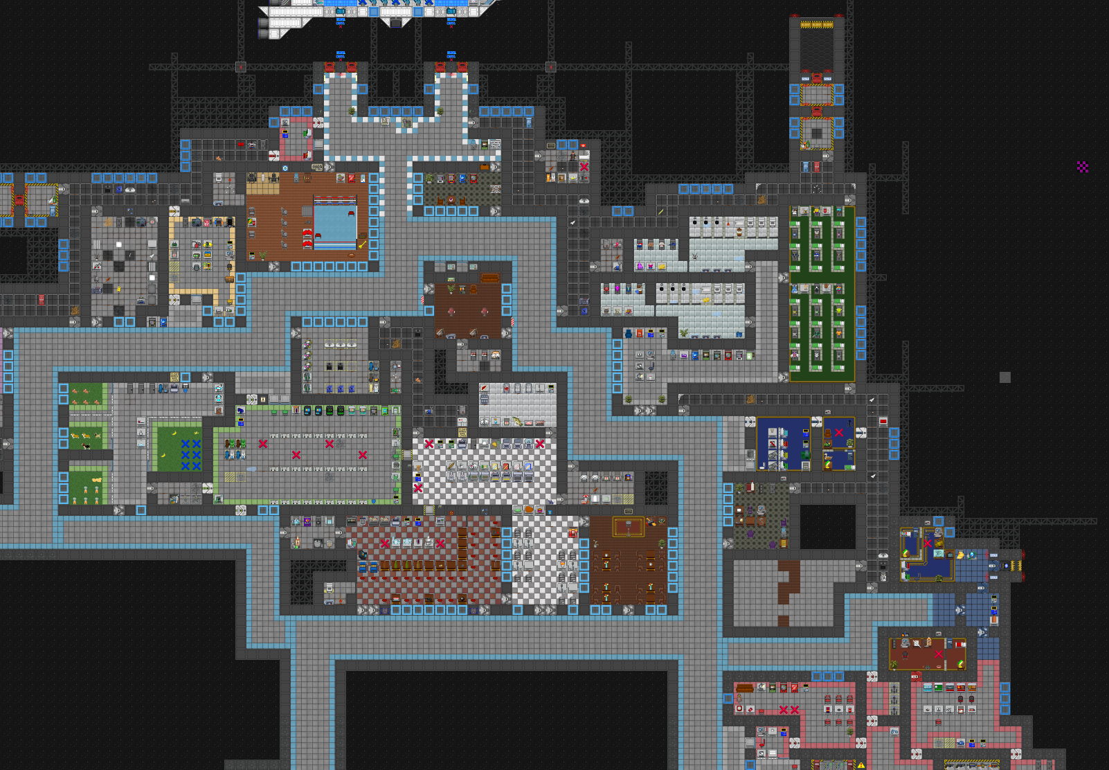
A lot of rooms took up way too much space, so I did a lot of downsizing early on. It’s easy to overestimate how much space a room will require.
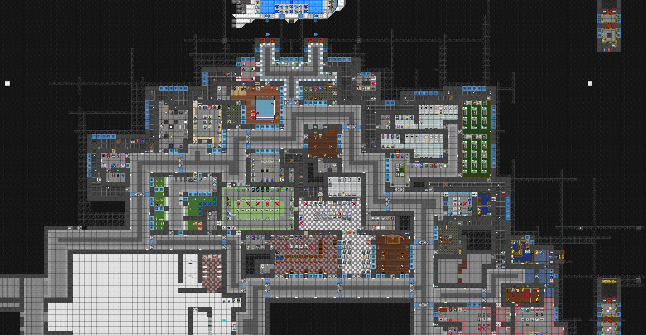
I spent a lot of time planning out the medbay initially before committing to working on it since it’s one of the most important parts of the station. From the medbay lobby, the northern route brings you to the surgery rooms and the southern route brings you to the corpse processing areas: the cloning lab (where dead players are brought back to life with the cloning machine), the morgue, the robotics lab (where dead players can be turned into cyborgs), and the genetics lab (where corpses can have their genes modified before being cloned). In the middle there’s a reception desk and a cryostasis chamber where patients can be put in cryochambers. The west side of the medbay contains the less important rooms, such as the storage room, a quarantine room for infected patients and the medical director’s office.
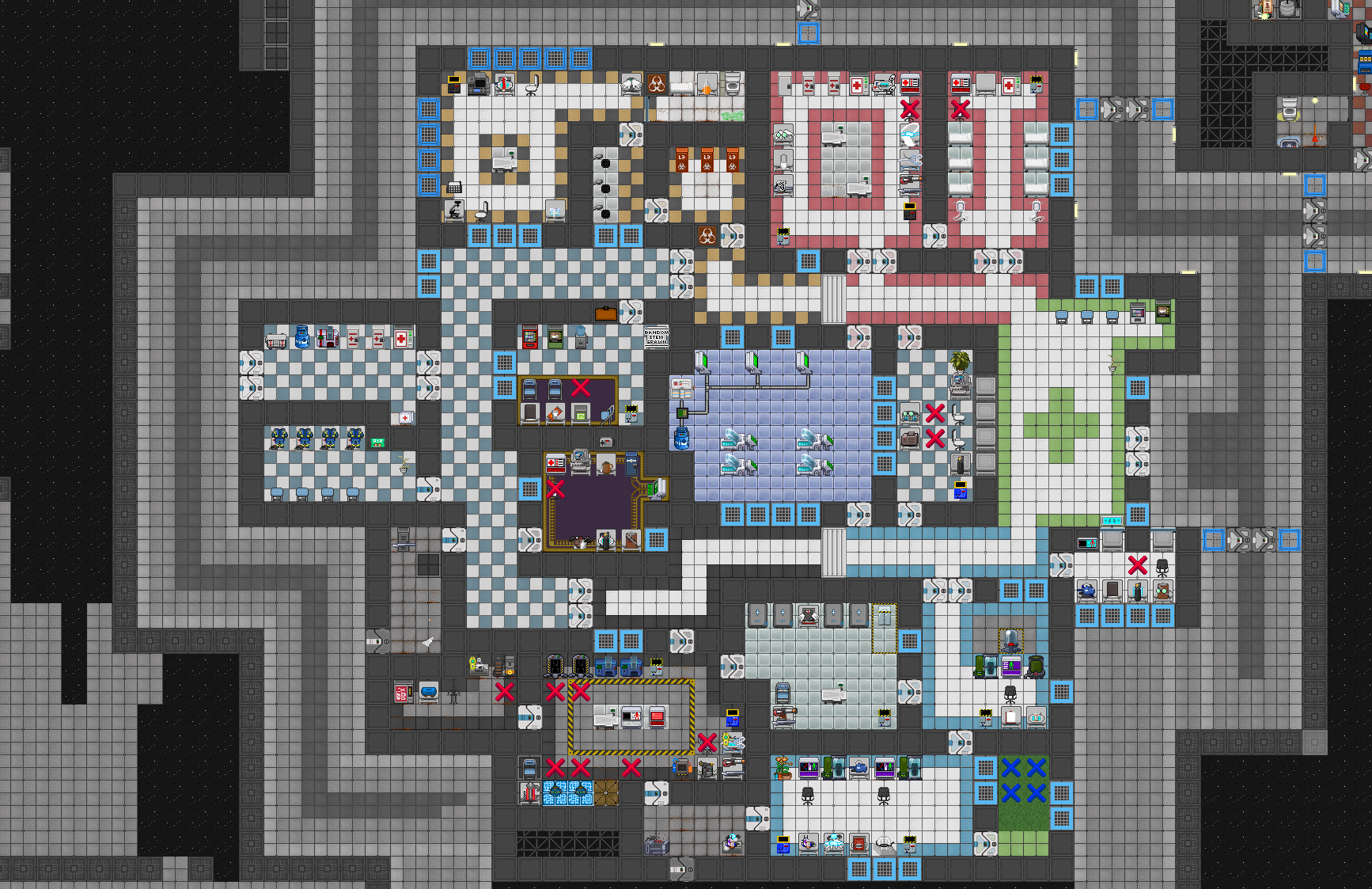
The medbay and security department were built, but far from perfect. These are the most important departments on the station so i spent a lot of time sharing screenshots with SS13 community developers and getting opinions from people who have made maps before.
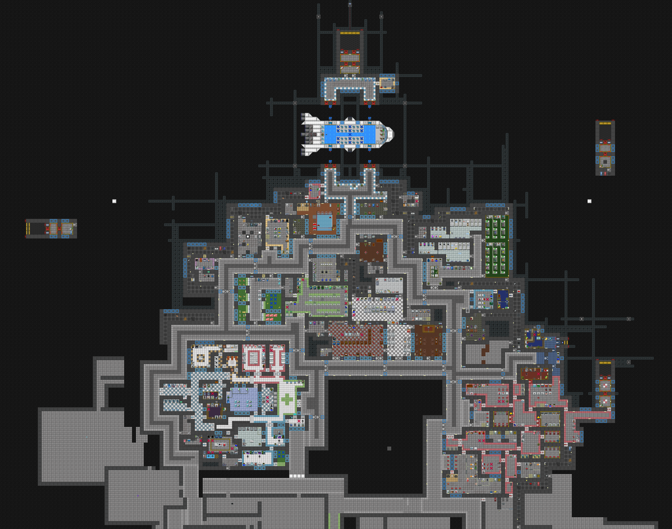
I redid security again after getting plenty of feedback, tweaked the medbay layout a bit, added the station bridge and worked on finishing the first pass for the research sector. The station bridge is kept airgapped from the rest of the station in the middle, which makes it very hard for villains to break into it without a space suit.
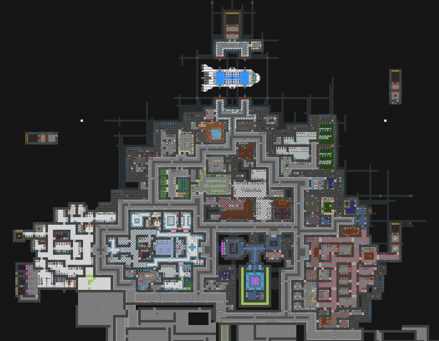
The security department and research department were mostly complete at this point. I did my first pass for the chapel, quartermaster’s office, pool, owlery, arcade and mechanics’ office.
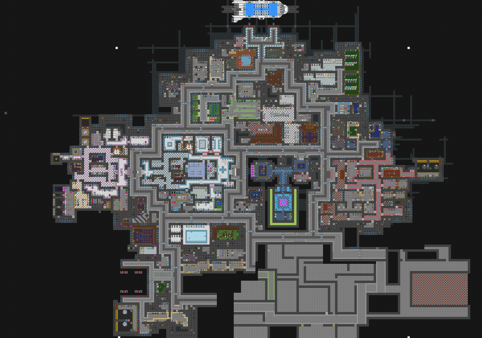
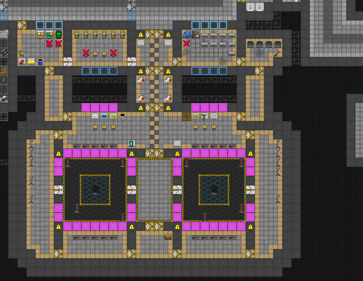
I decided to have a bit of fun with the engine design. Normally, a space station has a single engine that provides power to the station. The engine can be a thermo-electric generator (which is relatively safe to operate) or a singularity engine (which is easy to operate but also fairly dangerous since it’s pretty easy to turn off the containment field that stops the mini singularity from moving around and destroying the station). I opted to make a dual singularity engine.
With the engine finished, all i had to do was finish the engineering sector, the mining sector, the escape shuttle bay, and a few other miscellaneous departments. Even with the rough layouts for the departments completed, there was still a lot of work to do.
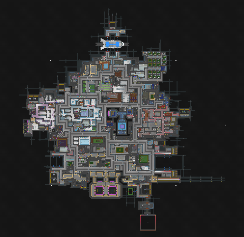
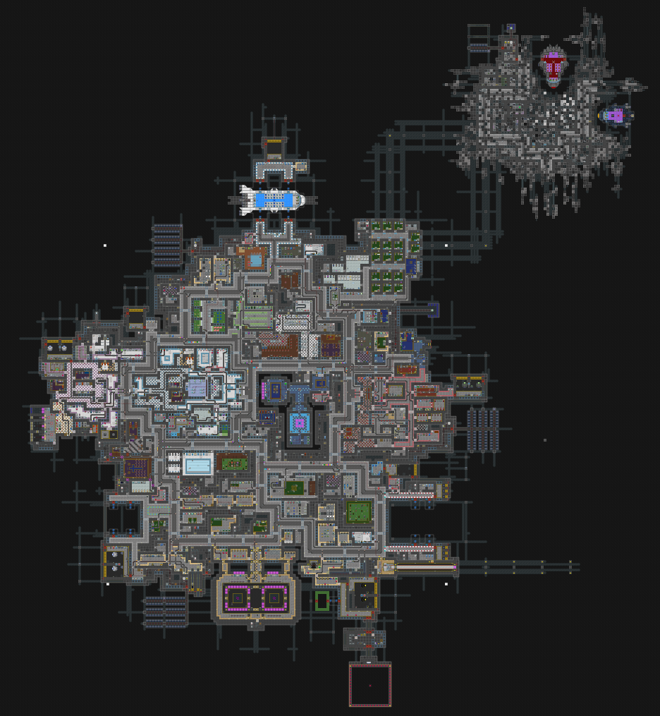
Solar panels are needed for backup energy if the station engine dies, so i placed 3 different arrays at different locations. I also added a wreckage to the northeast which serves as a separate spawn area used in certain gametypes (for example, the red ship is where rogue operatives will spawn).
A good space station will also have a network of mail chutes that allow players to mail items from one department to another, so i worked on that. Space stations also need a disposal chute network so players can send trash to the disposals room for processing. Light fixtures (with lightswitches), electrical wiring, area power control panels (also called APCs), security cameras and emergency air injectors are also something that every room needs.
It’s a good idea to really nail down your room layout before placing all of the auxiliary stuff like mail chutes. If you mess something up and it isn’t caught until you’ve placed all these things, you’ll have to do a lot of tedious surgery on your station to fix your mistake. After finishing everything and taking a step back to examine the station as a whole, I do have some regrets about certain aspects of the layout. The map has not been playtested yet so I can’t say for certain which areas really need to be reworked.
Since i used version control to keep track of my changes i wanted to make a timelapse animation showing my gradual progress. It was too much of a hassle to do, sadly.
The vital organs
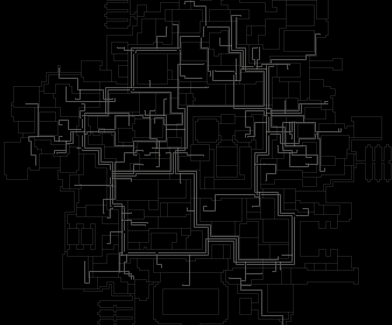
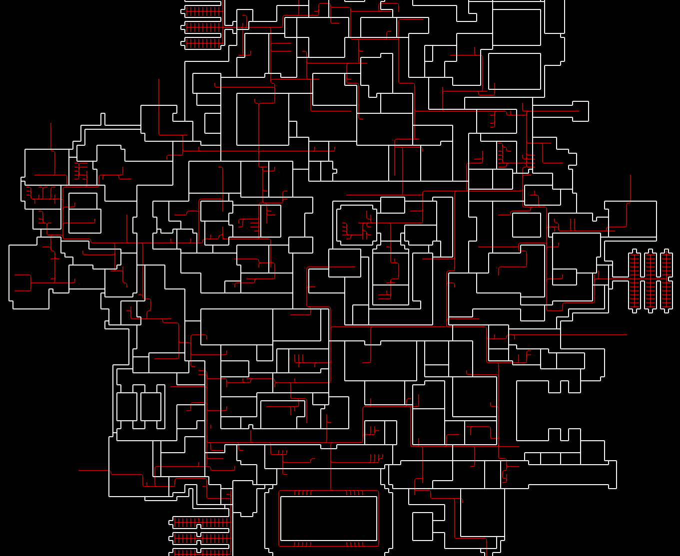
I took some screenshots of the various networks of underlying systems that all fit together to make the station.
The disposal and mail pipes:
The electrical wiring (with the contrast turned up to make the wires easier to see):
The walls and floors with all other stuff hidden:
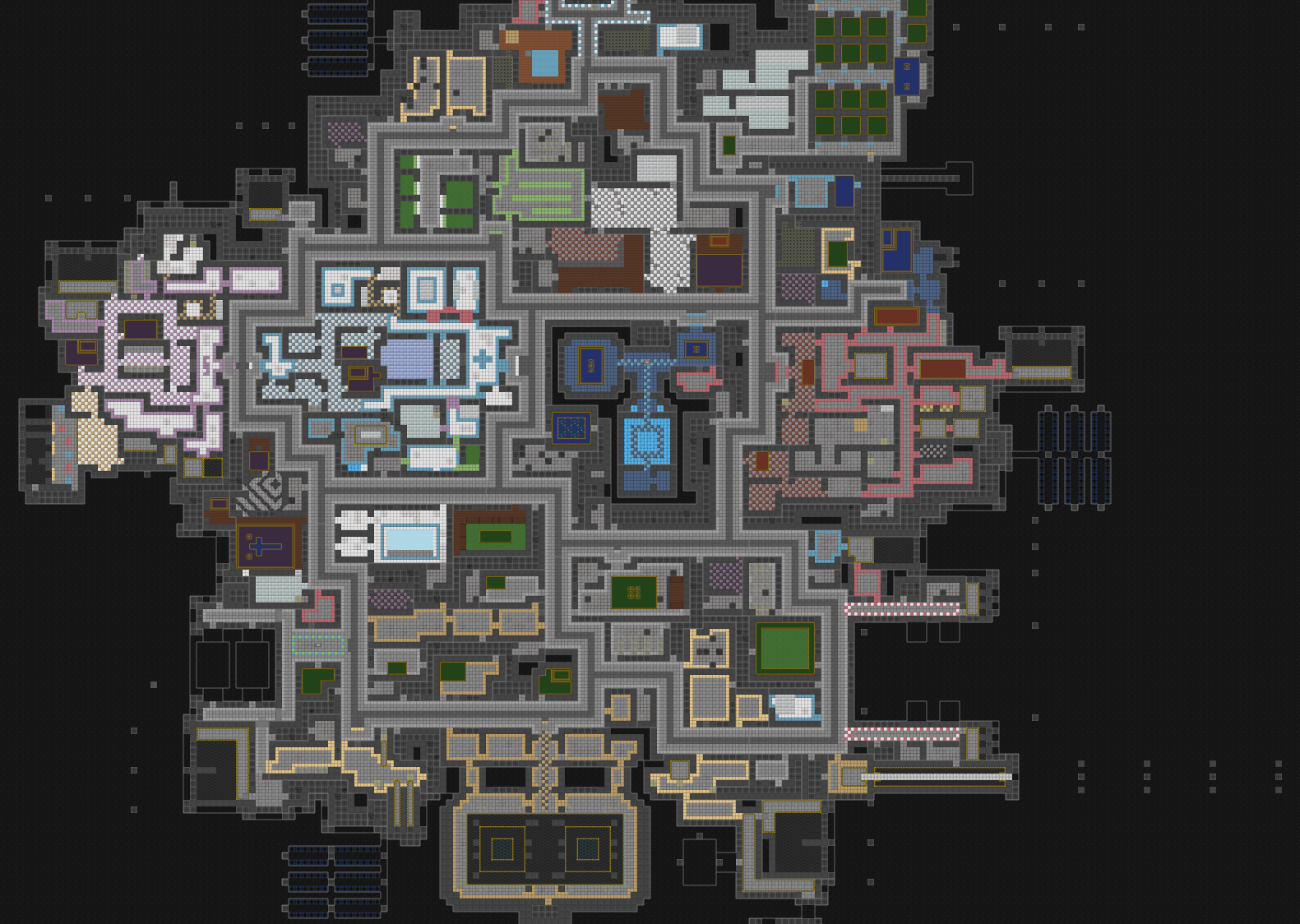
The wiring and pipe networks all follow the main hallways of the station since it makes them easier to access and generally just makes sense.
Is it good?
The map has gone through a lot of changes since I started work on it, but the question still remains: Is this map good at all?
This is a difficult question to answer. This map was designed using the goonstation codebase (recall that there are several communities, each with their own custom SS13 build). Since this map was made for goonstation, it needs to be tested on their servers (ideally with a good handful of volunteers). Getting a map accepted into production is an arduous process since it needs to pass inspection. This means that the administrators and coders need to sign off on it being admitted into the map pool, and any major design flaws need to be ironed out.
What constitutes a design flaw is kind of difficult to determine. Obvious mistakes like putting the medbay way too far from the center of the station will probably negatively impact a map’s impression on the community. There are many other aspects of the map that can be nitpicked, and it’s not always black and white. I fully expect that this map will be dissected and roasted many times over once it’s released as 1.0. Whether it will actually be accepted into production depends on how many aspects of its design are considered acceptable by the community.
There’s also a minor issue: I can’t get it to compile. It was designed using a third party map editor tool, and while i can open it with that tool, i can’t open it with the BYOND dev tools. Some aspect of the map file is causing the compiler to freak out and the error message it gives is too cryptic to be helpful.
For now this space station is stuck in limbo until I can coordinate with the developer of the other mapping tool to try and debug this map and figure out what is causing the crash.