Mordhau is a brilliant first-person melee game with deep mechanics and very satisfying crunching sounds when you club someone over the head with a sledgehammer.
The first person melee genre has been sparsely populated for a long time. Mount And Blade: Warband came out in 2010. Chivalry: Medieval Warfare came out in 2012 and enjoyed relatively little competition up until the release of Mordhau in 2018. Mordhau immediately took its place as the de facto first person melee game, and for good reason.
The combat mechanics in Mordhau follow the “easy to learn, hard to master” doctrine perfectly. The skill ceiling in this game is ridiculously high, but the skill of the average player is low enough that a bit of practice will make you an effective player. For those who are really dedicated to being the best at the game, there is always room to grow.
The combat system in Mordhau is so good that you could place a bunch of players in a big, flat, boring room and it would still be fun. The developers of this game were more ambitious than that, though. Perhaps to a fault. At launch time, the game had a collection of interesting maps where players have to complete various tasks such as pillaging a village or pushing a cart from point A to point B, all while fighting with the other team.
This mixture of combat with team-based objectives is absolutely a good thing, but this is where my praise for Mordhau stops and my criticisms begin.
Pick up that barrel
The main mode that players flock to in Mordhau is the objective based one. These servers can have either 32 or 48 player limits, so you get big fights that are always interesting. The maps these servers run always have some collection of objectives for teams to accomplish in order to win the round.
The basis for these objective based maps is a collection of capture points where teams need to stand in order to gain possession of that particular point. These capture points act as the focal points for the battle, and players are inevitably funneled to them. These capture points also determine where players will spawn, so owning less capture points means your team spawns further back in the map and therefore owns less territory.
These capture points often come with a prerequisite task, such as:
- Pushable carts or siege engines which must be moved from point A to point B before your team can advance further.
- A collection of NPC peasants you must slaughter in order to capture the next point. The defending team must defend these peasants to stop your team’s progress.
- Buildings that a player from your team must carry a heavy barrel of explosives to in order to destroy it. Typically you have to defend this player while they haul the keg since they move slowly and cannot defend themselves while holding it.
- A collection of buildings that your team must destroy using your weapons in order to advance, such as wooden barricades.
- A player-controlled VIP sort of character controlled by the top scoring player on the enemy team. These characters are taller than average and have a very strong weapon, but cannot heal themselves. The enemy team must defend this player while your team tries to kill them.
I personally don’t dislike some of these sub-objectives since they tend to make gameplay interesting, the problem is that some of these things only look good on paper.
- Objectives such as “slaughter X peasants” or “break X objects” typically do not take much effort for one team to complete. They are, for all intents and purposes, gimmicks.
- Player controlled VIP characters might sound fun but they create several problems. If one team is known to have this objective on one of their capture points, it creates an incentive for all the good players to rush to that team when the game begins (recall that the VIP character role is rewarded to the top scoring member of the team). The nature of this objective also means that players will try every dirty trick in the book to make it as miserable as possible for enemy players to reach the VIP. On certain maps, the VIP can hide in a house and have his teammates cover the entrances with spikes and barricades. On other maps, the VIP is given no cover at all and slowly has their health whittled away by enemy archers.
- The objective where you must carry a keg of explosives can be very difficult to achieve, and its difficulty varies greatly depending on the competence of your team and the other team. In many cases, players seem to just ignore the objective since nobody wants to be the guy who has to haul the keg to the objective and risk getting their head chopped off.
The pushable cart objective is the only one i don’t have major criticisms for. In the right setting i think it can be a good thing since it helps move the focal point of the battle and keeps things fresh and interesting.
Is it possible for a map to forgo these sub-objectives and just focus on the basic capture points though? It certainly wouldn’t be as flashy as the maps that have a jillion different tasks for your team to do in order to win. Would the primary focus on just capturing points be enough to make gameplay interesting?
This is the question I tried to answer by designing my own custom map.
The uSDK
As it turns out, this game does not have a fully functional SDK (yet). The community, with some help from the developers, cobbled together a project called the uSDK that resembles Mordhau but is populated with mostly placeholders. Mordhau is built in UE4 and as a result, many of the placeholder elements use the blueprint system. It turns out that this unofficial SDK has a lot of official game code contained within all of its blueprints.
This was my first time ever using UE4 but since i have some experience with working in the Source engine, it did not take long for me to get acquainted with the editor.
The general floorplan of my map was going to be a U-shape, and it was going to take place in a canyon. I made this choice because there was a glorious collection of cliff mesh assets included in the uSDK and i really wanted to make use of them. Every other aspect of the design of this map was just kind of thrown together on the fly. I find that improvisation can result in some very interesting stuff.
From start to finish
I maintained videos from every test session for this map since it’s always fun to see something built from scratch.
This is the earliest build i made of the map. A very basic layout lacking proper textures and lightmaps. It hurts my eyes just to look back on it. Still, it was an important milestone since I was new to the whole lighting bake process and the configuration of lightmaps.
I have an approach to design that might drive some people up the wall. I tend to start in one area and immediately flesh it out, rather than arranging a rough layout of the entire map off the bat. This is probably a bad idea for most people but I had a very clear picture in my head of what i wanted to go for.
You can see from these videos that the map was built from one end to the other in a linear fashion, with emphasis put on fleshing out each area with the “main” props before i continued forward. Lighting was still very rough around the edges since i hadn’t yet started tinkering with the myriad lighting settings under the hood.
This build was a huge step forward for me in several regards. The initial general placement of props was complete and i could visualize the map better. I fleshed out my landscape material using some existing textures from the uSDK and did some rough painting. I also did a little photoshopping to come up with my own cliff textures since the default cliff materials were mossy and not at all desert-esque.
I figured out a lot of minor improvements with this build. Lighting was improved, prop lightmaps were properly configured, capture point objectives were placed where i thought they should go, and detail props were added in some places.
It was around this time that i asked around the Mordhau modding community if someone could lend me a server for testing. This also helped with cleaning up the bugs you never find in singleplayer, and also allowed me to explore the map with other people and discuss bugs and spots that could be designed differently.
It’s amazing what a difference good lighting and a little atmospheric fog can make on a map. With this build i had also started detailing areas where there was too much empty space. I added patches of weeds, more detail props, and made revisions to the map layout in a few spots.
Lighting is incredibly finicky and takes several iterations to get just right. With this build i also added a bunch of decals to the ground to make it more interesting. I avoided large areas with a contiguous ground material since these kinds of areas really stick out as unpolished. The human brain is very good at noticing patterns, so I avoid displaying wide open areas of a tiling texture. If that’s unavoidable, i scatter detail props on the ground (such as planks of wood) and add spots of dirt or grass to break up the monotony.
I also dabbled with using spline meshes to create roads around the map to make long stretches a little more interesting. This, to me, is like sorcery.
For my official 1.0 build there was a lot of under-the-hood stuff to do. The game logic i wanted had to actually be programmed via the blueprint system.
I gotta say, the most impressive thing from my newbie perspective is the power that the blueprint system gives the level designer. I’m used to the game logic being a totally separate entity from the level, which isn’t the case here. I used blueprints for several aspects of this map.
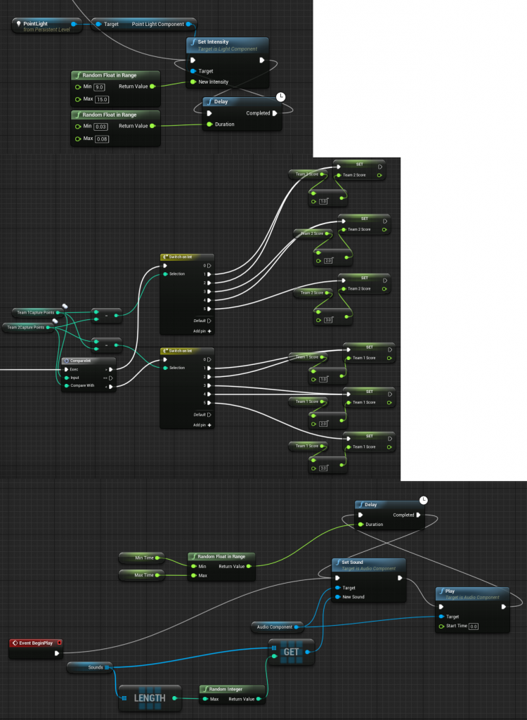
The top blueprint was used to create a flickering light effect on the campfire. The second blueprint handles the score calculations for both teams. The final blueprint is used to make an audio emitter play a random sound from a specified list of sounds at random intervals. This is useful for adding ambient sound around the map, such as creaking wood on the wooden walkways.
This blueprint system is tremendously useful, if something doesn’t behave exactly how you want it to you can just program additional functionality for it. But blueprints also have a dark side…
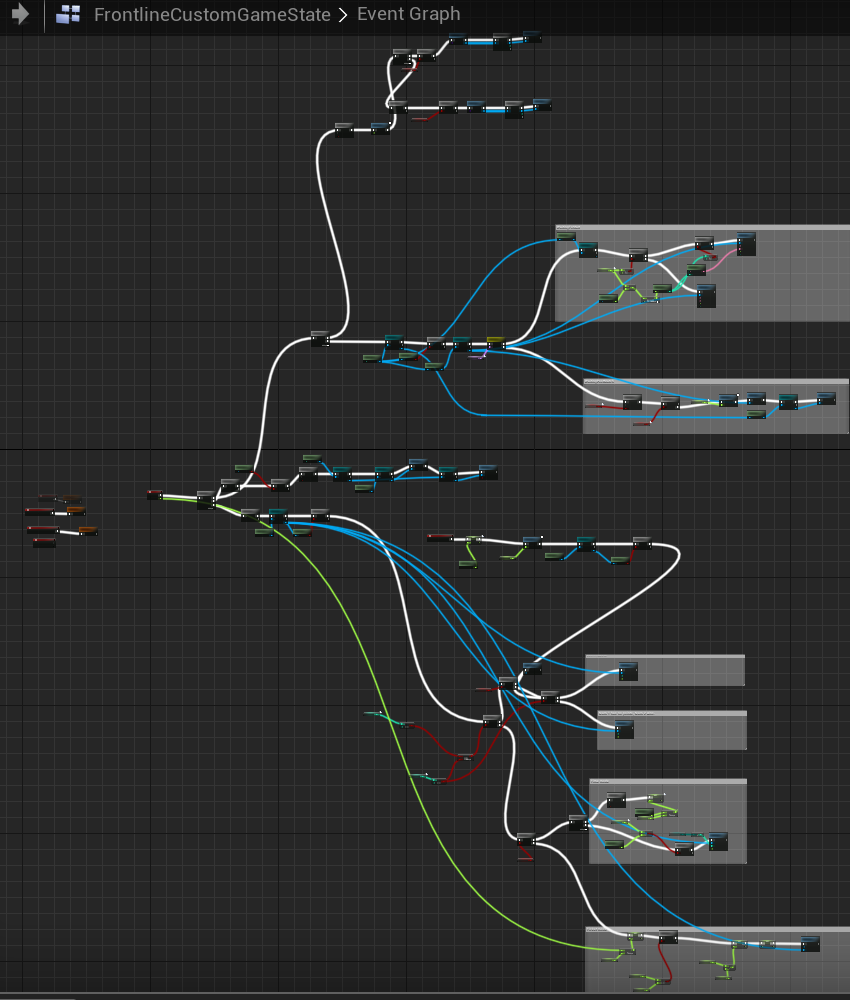
This is the blueprint for my custom game state. Normally since i’m deriving from an existing game state i wouldn’t have had to change much, but I had to bypass the parent class in some cases and use its parents logic. Blueprints become exceedingly difficult to manage as they grow in size and i’m glad i didn’t have to do this too much.
Materials
Materials deserve their own section of this post because the unreal engine has such a crazy material system. There are several noteworthy materials i had to make from scratch for this project. The most obvious is the landscape material, which blends 4 different textures.
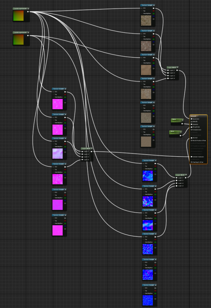
For decals, the uSDK provides the textures but no corresponding materials. So i had to create my own materials to get them working as intended.
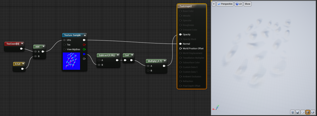
This footsteps decal is meant to just apply a normal map to a surface to give the appearance that there are a bunch of footprints. In order to accomplish that, I plug the normal map into the normal input for the texture and then use the blue channel of the normal map to determine the opacity of the decal. This works well enough and allows me to make it look like there’s been a lot of foot traffic in certain areas.
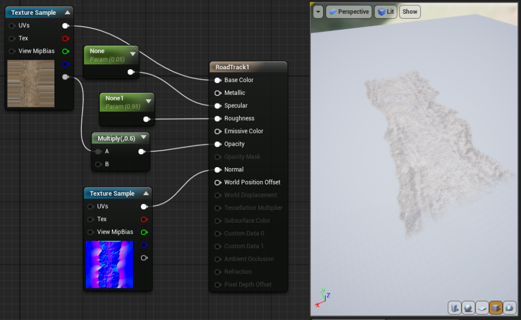
For wagon tracks, i just combine a simple transparent decal with a normal map and reduce the opacity by 40% so it blends a bit better with the ground.
Next steps
Now that this map is fully playable and fleshed out, i’ve released it on mod.io so that server owners can access it. So far it’s not being used all that much, i’d like to do a live test session as soon as possible. Currently the map is at 850 subscriptions so i’m hoping it will get even more popular as time passes and see some action on a server that’s populated.
Maybe once it’s been playtested enough i’ll be able to get an idea of which areas need tweaking. Until then, i’m gonna give it some time to circulate through the community.